How to Design A Book Cover for Ooligan Press

Rhythm in the Rain Final Front Cover Erika Schnatz

The idiom goes, “Don’t judge a book by its cover.” As someone who has created a handful of cover designs, I say, judge away. If the cover design is effective, it will help sell the book.

Many publishers have a designer or teams of designers on staff to tackle book cover design, but since Ooligan Press is a teaching press, it relies on its students to take cover concepts from brainstorm to final files. Under the helpful guidance of the Design & Production Manager (my role during the 2014-2015 academic year) and a weekly peer critique, students design each book published at the press.

The cover design process at Ooligan is democratic; students who attend the design meetings vote for the top three cover concepts, then the whole press votes on which design will make it to print. After designing a number of concepts that didn’t quite make the cut, one of my concepts was chosen as the final cover for Rhythm in the Rain: Jazz in the Pacific Northwest (woo!). Here is how the process went:

  1. Read the design brief: the project team working on the book puts together a design brief with the assistance of the design manager and then it’s sent out to the entire press via email. Since there was no manuscript available to peruse (normally step 2), the design brief was doubly important.
  2. Brainstorm! If you’re like me, this means some pencil-on-paper action to play with shapes, concepts, and overall composition before/after/during a search for design inspiration. And writing teeny tiny notes to yourself.

Rhythm in the Rain cover comps Erika Schnatz

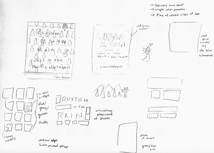
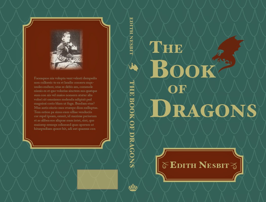
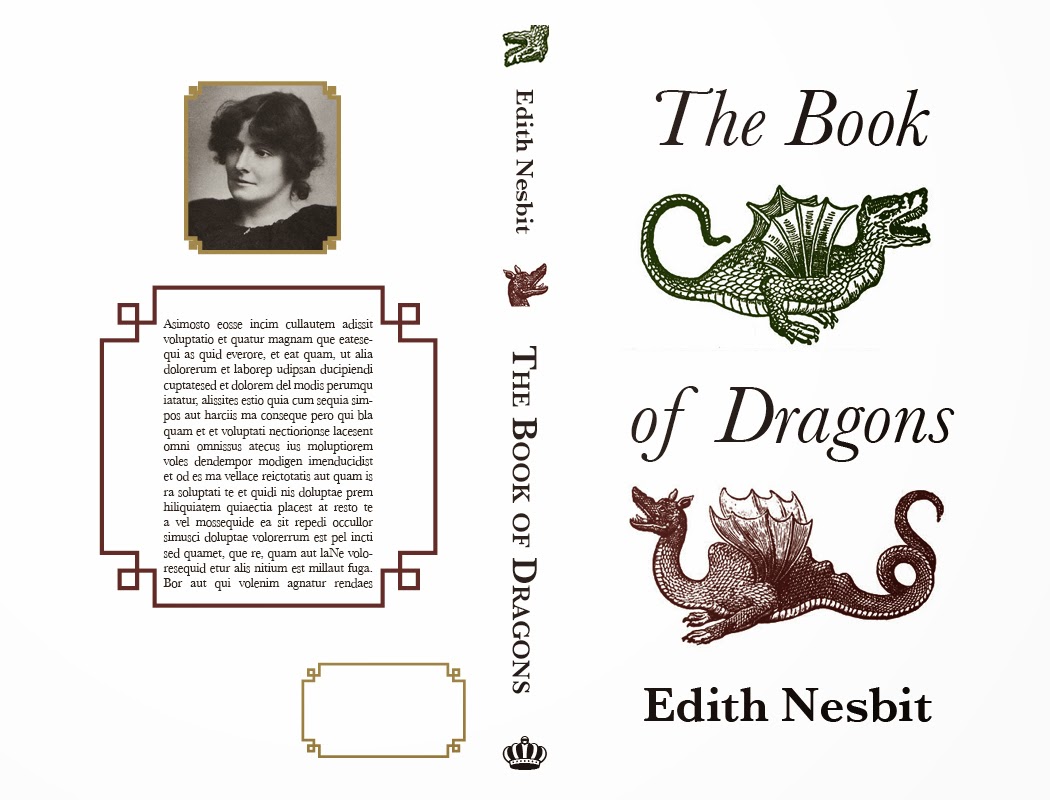
3. Make some mock-ups: Time to hop on the computer and create some comps. These are the initial three designs I brought to our peer critique:

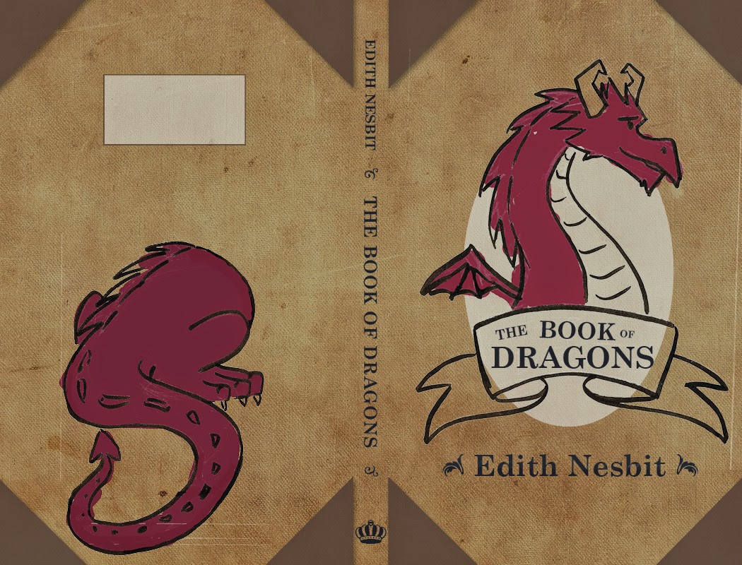
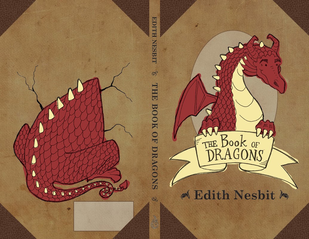
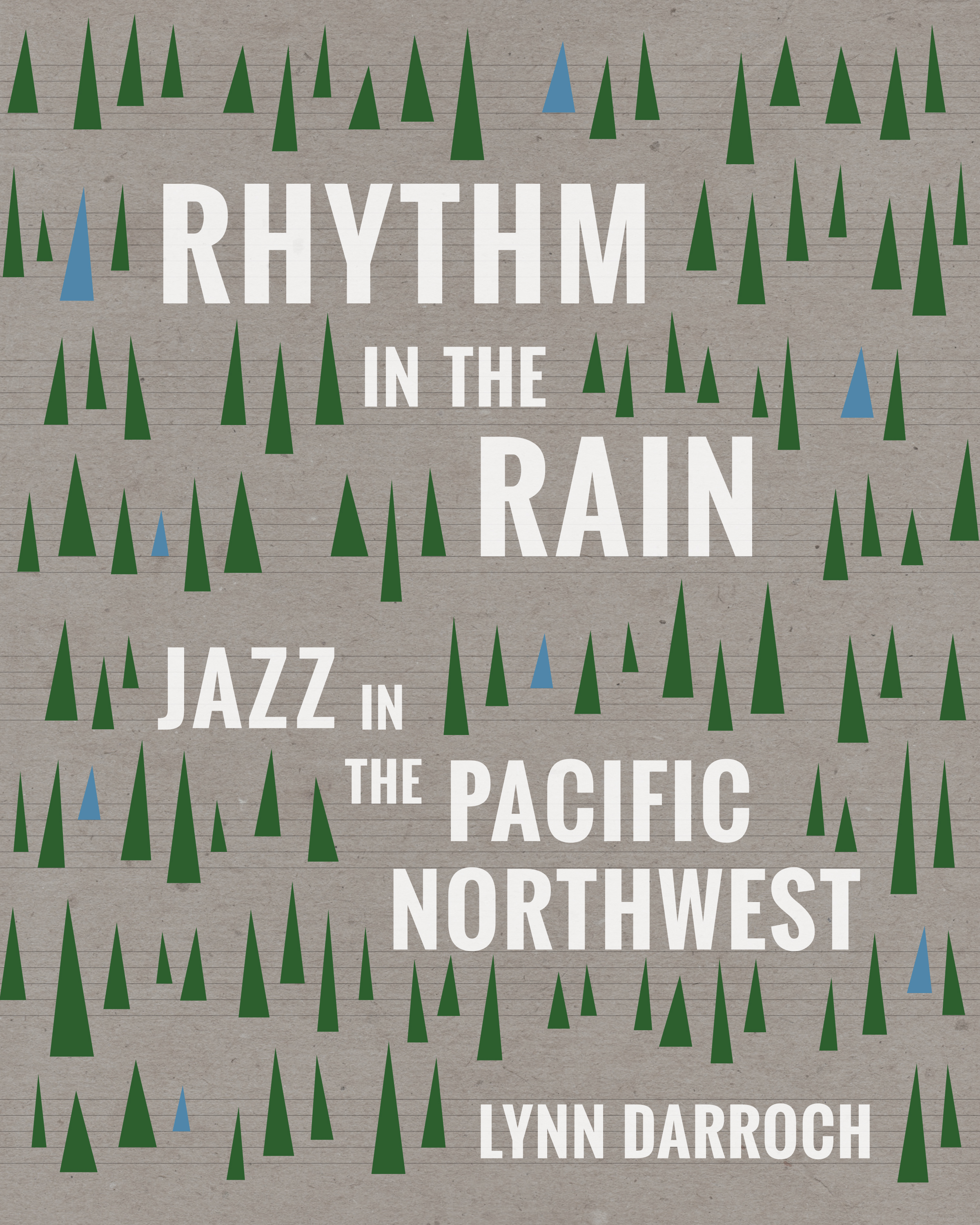
4. Revision, revision, revision: My peers responded most positively to design #2, so I took their feedback and ran with it, to produce the following variations:

5. Cover vote! After a few weeks of revision time, the design team voted on three cover concepts to go in front of the entire press. My design was one of the three, and I believe the first cover above was the one I chose to show (I hadn’t had time to make too many adjustments in the prior weeks). We received some feedback from the author on the final three cover concepts, and members of the press chimed in with their own thoughts. Some of it was useful and some of it was not. It was pointed out to me that the bark texture in the background was a bit arbitrary (I agreed). The final vote was tallied, my concept was chosen, and it was time to get back to work:

From this point on design decisions were made by the publisher, the project manager, and myself. When I sent out these variations, the third version was the clear standout. From there it was a series of very small nitpicky design changes, like moving trees around and playing with the background color of the cover.

Rhythm in the Rain Final Front Cover Erika Schnatz

6. Finish it: Once a front cover was agreed upon, it was time to design the spine and back cover. The back cover will inevitably change a bit before the book is printed based on the blurbs and book summary, so I had some fun with the placeholder quotes in the meantime. Voilà!

Rhythm in the Rain Final Full Cover Erika Schnatz

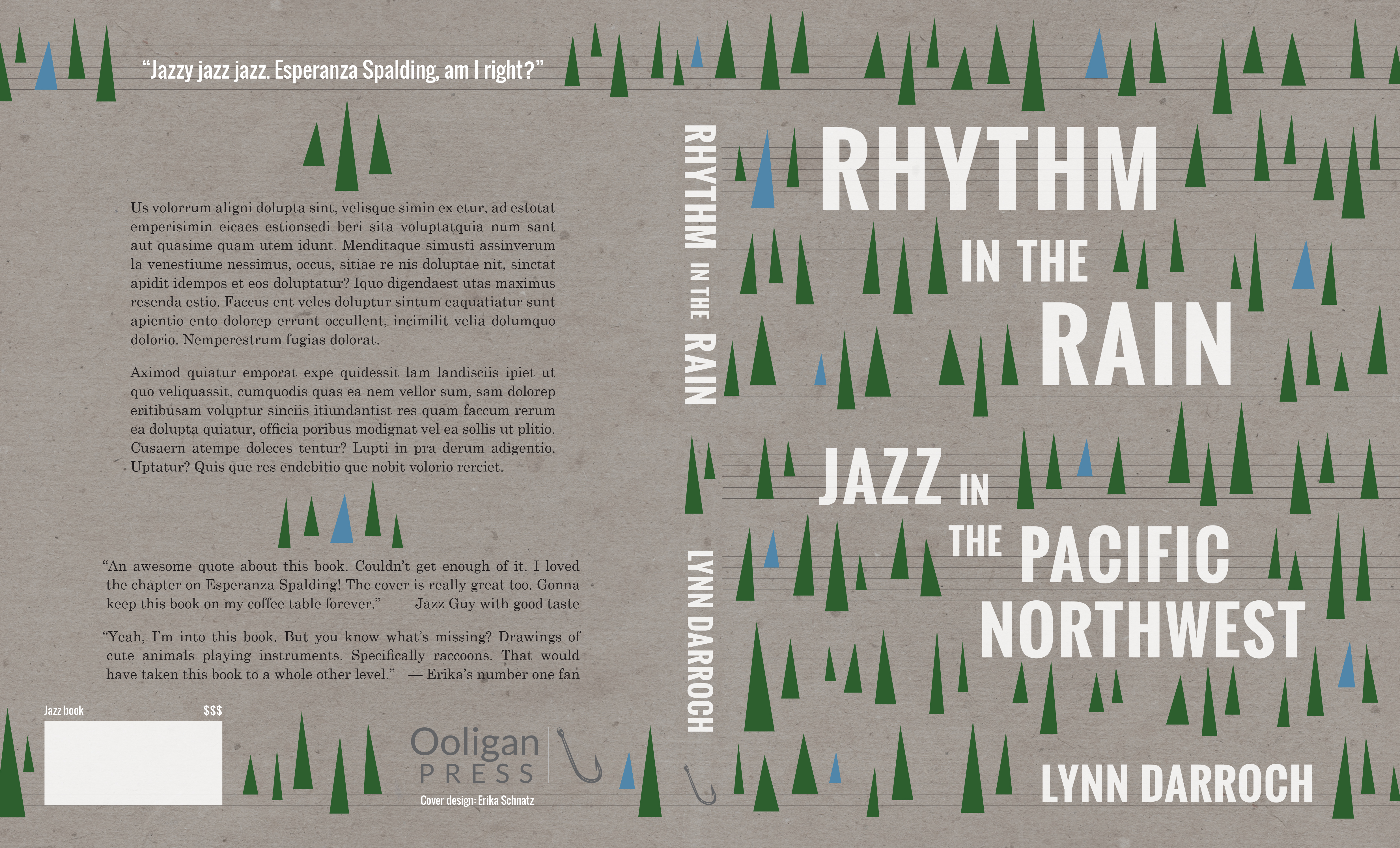
(Since Esperanza Spalding is one of the most well-known jazz figures in the Pacific Northwest, she turned into something of an inside joke. Sorry, Esperanza!) If you need a design for your next book, I’m available!

Here Be Dragons!

For my Book Design class this term, I had to design an entire book (it was awesome!) so here are the cover comps I came up with:

This first one had some nice elements, but it looked a bit old for the target audience of this book (middle-grade level readers).

I really liked this design as well, but it looks like an adult book.

This one was the clear favorite of my peers. It was by far the most age appropriate, and since it’s a book for younger audiences, I could get away with having an image-based back cover. The author photo and bio is much more of an adult book element anyway.

Here’s the final! I made some suggested improvements, like handlettering the text on the cover and adding the dragon’s arms to hold the banner. I obviously redrew the front and back illustrations as well, and added some cracks around the dragon butt to add to the illusion of the dragon breaking through the back of the book cover. My classmates liked where the colors bled outside the lines in the comp, so I replicated that in the final. I moved the ISBN box to a more sensible place as well.

I had some trouble finding reference images for the dragon’s butt, but as multiple people reminded me, dragons aren’t real so I could draw it however I liked.

Ooligan Press Blog Branding

I’ve completed my first year of grad school. Crazy! The next few months are going to be relatively light, responsibility-wise, so expect to see new material pop up in your news feeds on a regular basis. Unless I get really lazy this summer…

Anyway, what follows are some blog badges I created for the student-run publisher I work for, Ooligan Press. We’re working on rebranding the Press and changing up the website, and my silly little doodles are part of it all.

First time around I created everything in Adobe Illustrator, which made everything graphic and clean, but these were missing the hand-drawn/human element that is an integral part of the press’ identity.

These initial badges aren’t bad, but our digital and social media department lead was looking for something that is obviously made by the human hand. So I went back to the drawing board (literally), and came up with these:

You may notice I was roped into creating a few more badges. This is not the last you’ll see of the Ooligan-related work I did this term.

Serve San Francisco T Shirts

My apologies for the lack of posts. I’ve been traveling a lot in the past month and I’ve been slacking on my art stuff. Here’s something I worked on during the past week:
I am currently an AmeriCorps member, and I like to help my peers out when I can. When another member of my program needed help with t shirts, I volunteered my services. Her group is going on several alternative spring break trips, and they need to outfit everyone in t shirts. 
This is an idea from one of the students she works with. It was a basic design for their upcoming trip to San Francisco.
However, I wanted to try and give them something with a little more character than a city skyline. I find that it’s really hard to distinguish city skylines from each other unless there are strong visual indicators (like the Eiffel Tower in Paris), so I wanted to do something else. I drew a cable car, since I associate them with San Francisco.
Above is the basic sketch for the cable car, based on some old travel posters I found on Google.

This is was what I submitted to them for the front of the t shirt.

I didn’t veer very far from their original idea for the back.
So I submitted it, and none of the alternative spring break committee members preferred my cable car design to their idea of the city skyline. So I wound up going back and creating this for them:

Below is a rough idea of what the t shirt will look like:

So there you have it. I learned not to mess with a design idea they really liked, because it cost me time and energy (especially because it was all pro-bono stuff). Meh. I still like my cable car drawing.

Blue Moon

I just realized this post could have been very timely had I posted it the night of the blue moon. However I wasn’t thinking about that, so you’ll get this post now.

I had the pleasure of designing a t-shirt for my high school marching band this year (I also did it last year – I’ll have to find those images for another entry). The theme for their show is “Shadows” and it features “A Night on Bald Mountain”. I watched the Fantasia animated clip for that tune and had a pretty complicated idea in mind involving demons and witches and skeletons. Since I’m a lazy bum I didn’t do much to flesh out the idea, which worked out to my favor, because the band director wanted something involving the moon. They have a backdrop for the field of a giant moon and clouds, so he wanted that idea to translate to the t-shirt.

I figured the idea would be super easy, and I’d whip something out in no time. Not the case my friends. I struggled for a bit before landing on a concept.

First I tried using a photograph of the moon and clouds, and I tooled around with it in Photoshop, but my digital skills are limited and I was frustrated with the results:

Mind you, this is the inverted image because it would be white ink printed on a black t-shirt. I spent way too much time trying to make it work, it was so uninspired. I was also concerned about how well the image would print on a t-shirt, because there are a lot of gray tones in that image that might not come through in a one color print (I took a screenprinting class in college so I have a little bit of experience with setting up silkscreens).

I was also unhappy that I used a photograph. It felt like cheating. I am an illustrator, so anything I do that isn’t drawn out doesn’t feel authentic to me. Cue design disaster number two:

Granted, this isn’t terrible, but I knew the image wasn’t going to translate too well to the screenprinting process. Plus there was no narrative – just a moon and some clouds. I didn’t like this either, but at least I got some practice with Photoshop brushes.
Finally inspiration struck! I was looking at pictures of full moons and I really liked the effect of shadows of objects in front of the moon. It was a really nice framing device. Once I came up with that concept, the rough sketch came out easy peasy.
Visual inspiration.
This is the final result for the front of the t-shirt. I was very happy I was able to add a slightly creepy narrative to the illustration and figure out a way to “ground” the moon.
Here’s the back:

Whew. That was a wordy post. Next time I’ll just post doodles of kittens or something.

Oh yes, one more tidbit of information: all of the images for this shirt were drawn with my Wacom tablet. I almost always scan in a sketch and work on top of it, but this time I drew on blank layers in Photoshop while looking at my sketch. I saved a lot of time by cutting out that middle step. Perhaps I will start doodling on my tablet more often.