As you may have noticed, my website is getting a complete makeover right now. I’m currently on spring break and Portland is its usual gloomy self, so it’s the perfect time to sit in front of my computer all day and Photoshop until I can’t Photoshop anymore (bright side: I’m becoming a master of keyboard shortcuts!). Since this is the first time I’ve worked on this website by myself, it’s becoming quite the learning experience. Please bear with me as I work out the kinks! More projects will be popping up tomorrow.
planning
Here Be Dragons!
For my Book Design class this term, I had to design an entire book (it was awesome!) so here are the cover comps I came up with:
This first one had some nice elements, but it looked a bit old for the target audience of this book (middle-grade level readers).
I really liked this design as well, but it looks like an adult book.
Here’s the final! I made some suggested improvements, like handlettering the text on the cover and adding the dragon’s arms to hold the banner. I obviously redrew the front and back illustrations as well, and added some cracks around the dragon butt to add to the illusion of the dragon breaking through the back of the book cover. My classmates liked where the colors bled outside the lines in the comp, so I replicated that in the final. I moved the ISBN box to a more sensible place as well.
I had some trouble finding reference images for the dragon’s butt, but as multiple people reminded me, dragons aren’t real so I could draw it however I liked.
Dancing Cats
Continuing the week of cuteness, here are more cats (if you need more cats drawings, just scroll through past blog posts). I was supposed to have a finished spread for the SCBWI-Oregon conference, but grad school got in the way, so I only finished the line art. This summer I need to color it in. Of course, nothing I do is going to compare to Jon Klassen’s work, but a girl can dream.
Initial sketch:
MAPS Re-branding
Ooligan is not the only rebranding I’ve worked on this term. I wound up reworking one of my own designs for the MAPS team, a group of peer mentors that I am responsible for organizing. Conveniently, this means I can change the look of our brand whenever I want, because I have the power (please read that in a He-Man voice because I think he says that).
Anyway, long story short, I had to update the logo to make it digital-friendly. It lost a bit of it’s character, but it’s sleek-looking! Also, I learned what kerning was.
Original:
MAPS Logo Design
At the beginning of August I began my new AmeriCorps position at Portland State University. My official title is Retention Project Program Assistant (fancy, I know) and it comes with perks. Like my own office. There’s also this amazing copier that can scan in documents and send them as e-mail attachments, which blew my mind. It’s also how I got all of the images for this post onto my computer.
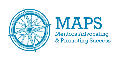
Anyway, the program I’m working with was initiated last year and is in a bit of a transition period this year. Someone made a logo for the program last year, which looked like this:
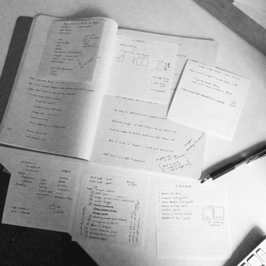
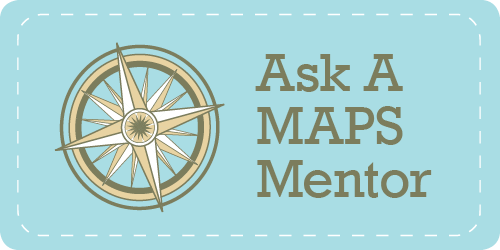
I didn’t hate it, but I thought it looked a bit amateur, especially for a university program that does important, good work. I kept the basic idea of the compass and found some reference material:
I drew one thumbnail and went with it. I know that’s frowned upon with logo design, but since I was tweaking a design and not inventing it, I thought that was enough brainstorming. So here’s how it turned out:
I like how it turned out. Plus now I feel like I’ve done something productive (I’ve done a lot of reading at work but not much else). It’s always fun when I can use my art skills for good.
Quick note: there is a rose in the center of the compass because one of Portland’s nicknames is “Rose City”. Knowledge is power!
Materials used: Micron pens, Photoshop/Illustrator