Ooligan is not the only rebranding I’ve worked on this term. I wound up reworking one of my own designs for the MAPS team, a group of peer mentors that I am responsible for organizing. Conveniently, this means I can change the look of our brand whenever I want, because I have the power (please read that in a He-Man voice because I think he says that).
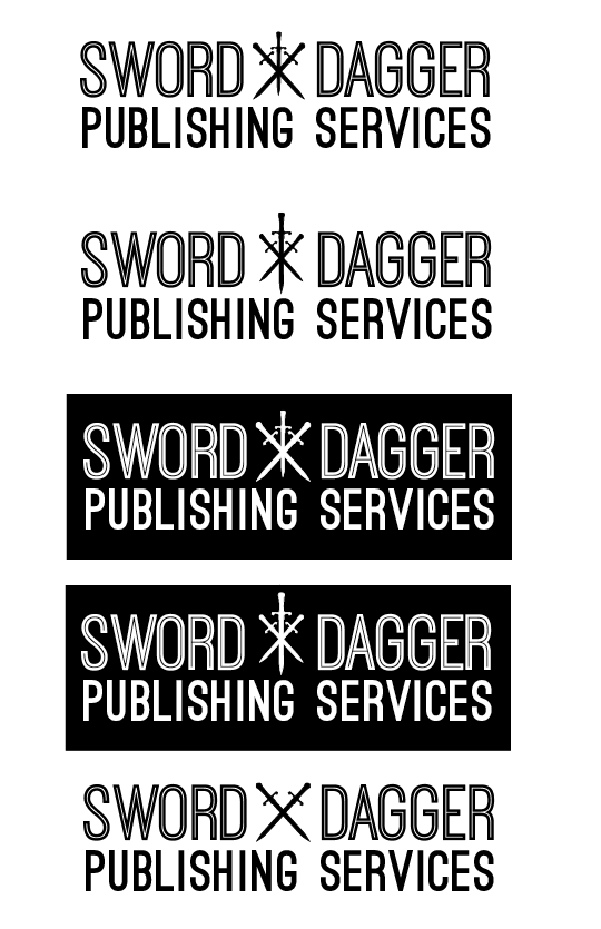
Anyway, long story short, I had to update the logo to make it digital-friendly. It lost a bit of it’s character, but it’s sleek-looking! Also, I learned what kerning was.
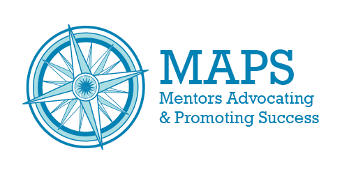
Original:
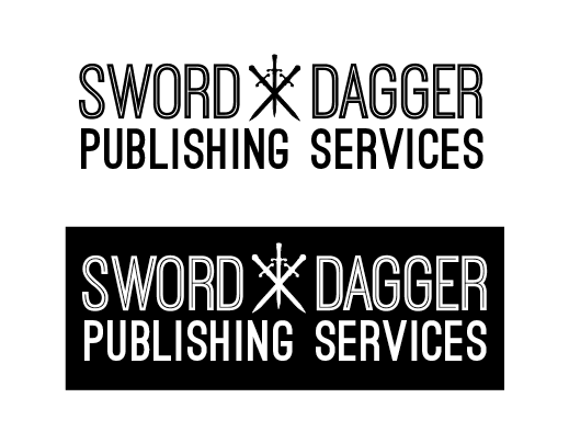
Revamped:
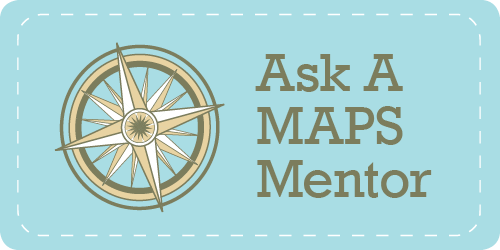
A fancy button I made that connects to a fancy webform:
All of the revised work fits with Portland State University’s visual branding guidelines, which is probably important if this mentor group is going to have any longevity. Hooray for learning graphic design things!