I made a halfhearted attempt to get onboard the #inktober train this month. Managed to produce 3 drawings so far, based on twitter @Daily_Doodle prompts.
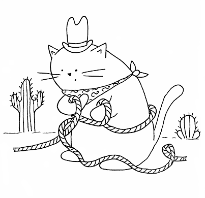 |
| #cowboycat |
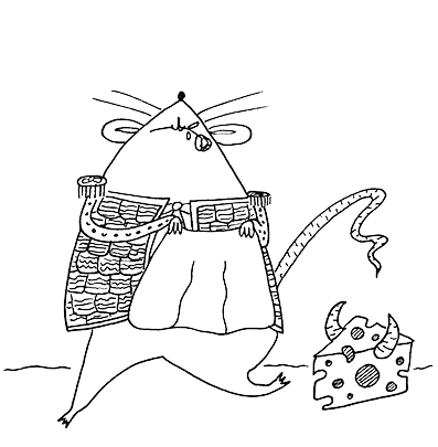 |
| #matadormouse |
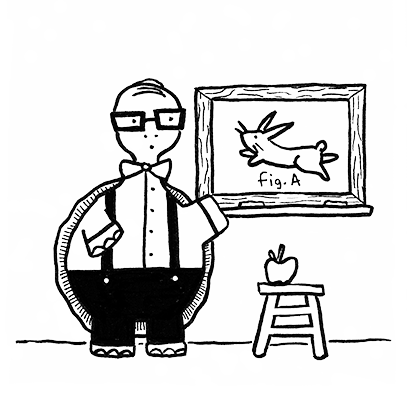 |
| #teachertortoise |
I made a halfhearted attempt to get onboard the #inktober train this month. Managed to produce 3 drawings so far, based on twitter @Daily_Doodle prompts.
|
| #cowboycat |
|
| #matadormouse |
|
| #teachertortoise |
Here’s another little thing I whipped up for Ooligan Press:
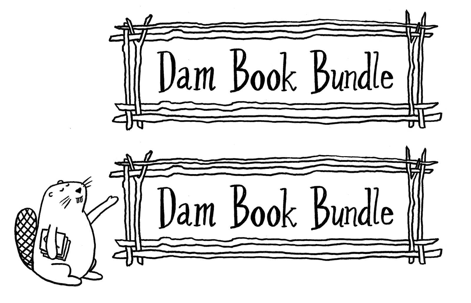
I offered a beaver-less option if the press wanted to be a bit more high-brow, but I’m happy to see the little guy made the cut.
Ooligan Press is putting together “Dam Book Bundles” – basically a collection of 3 titles that our press has published. The titles are offered at a discount because you’re buying multiple books. It’s a pretty sweet deal, and you can check it out here if you want to buy some excellent titles from a student-run independent press. Check it out for the puns alone!
For my Book Design class this term, I had to design an entire book (it was awesome!) so here are the cover comps I came up with:
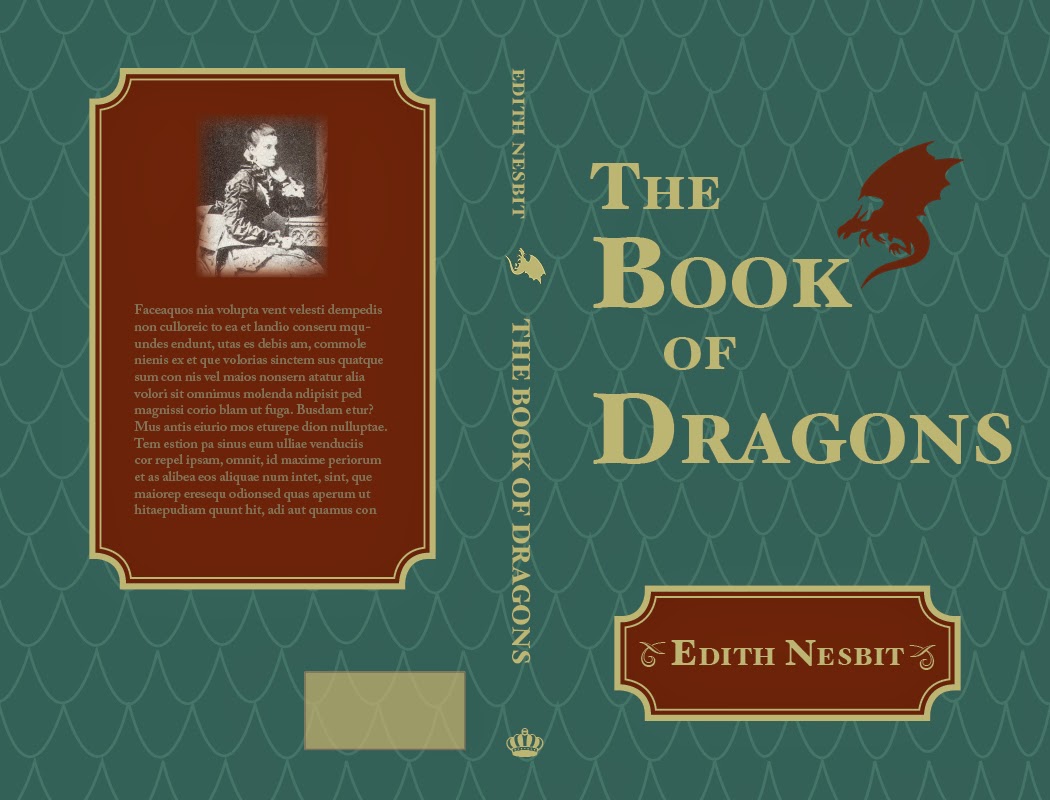
This first one had some nice elements, but it looked a bit old for the target audience of this book (middle-grade level readers).
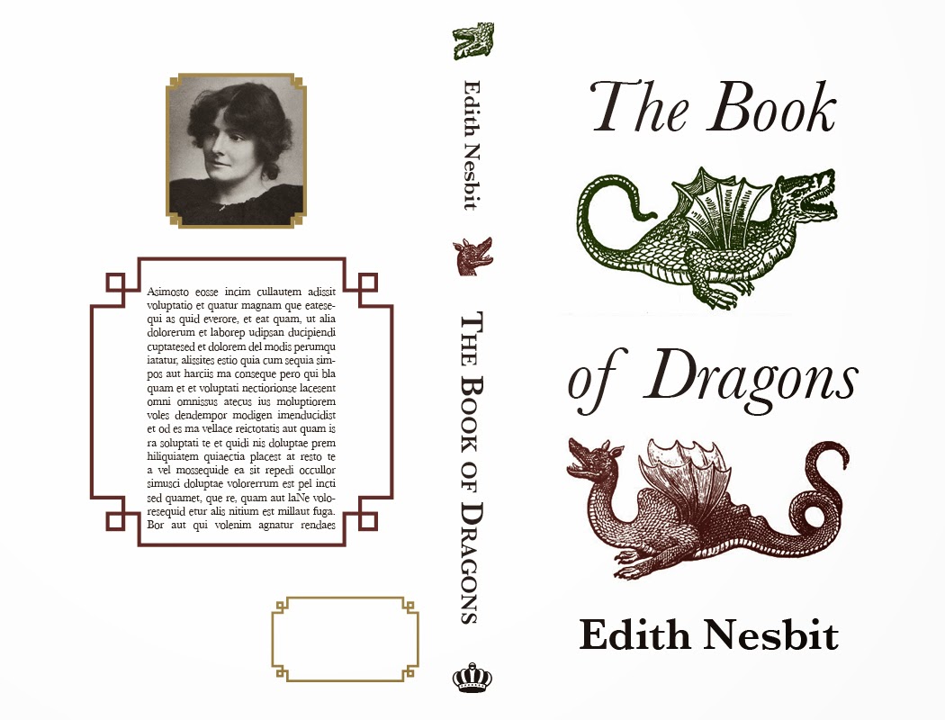
I really liked this design as well, but it looks like an adult book.
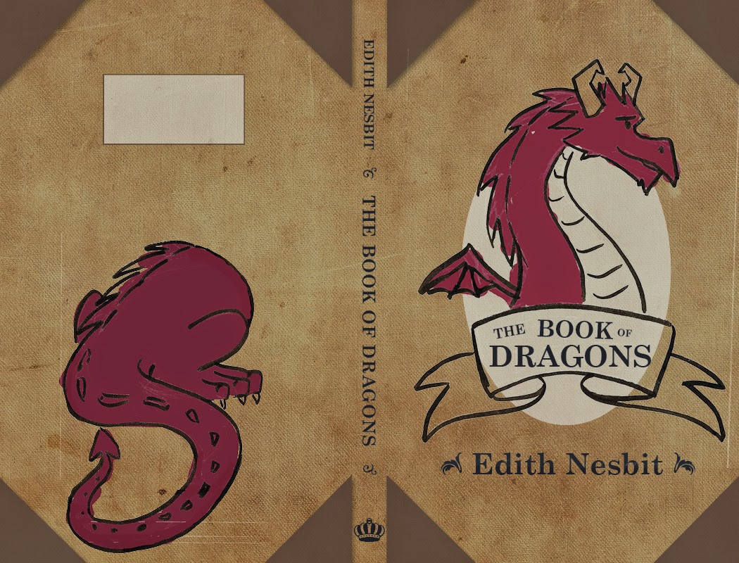
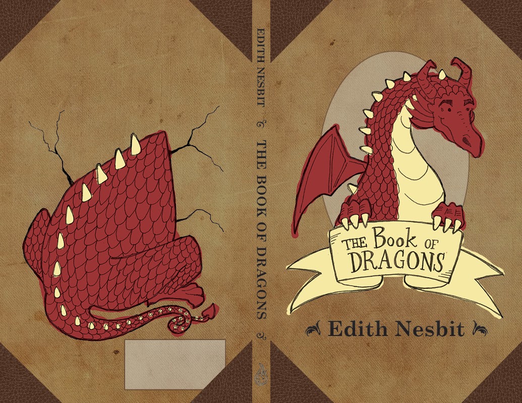
Here’s the final! I made some suggested improvements, like handlettering the text on the cover and adding the dragon’s arms to hold the banner. I obviously redrew the front and back illustrations as well, and added some cracks around the dragon butt to add to the illusion of the dragon breaking through the back of the book cover. My classmates liked where the colors bled outside the lines in the comp, so I replicated that in the final. I moved the ISBN box to a more sensible place as well.
I had some trouble finding reference images for the dragon’s butt, but as multiple people reminded me, dragons aren’t real so I could draw it however I liked.
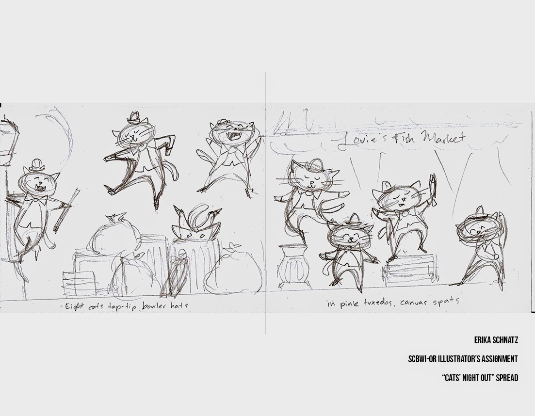
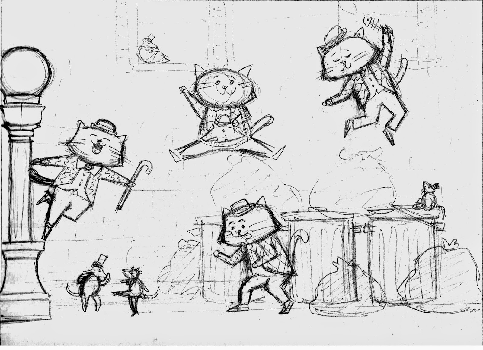
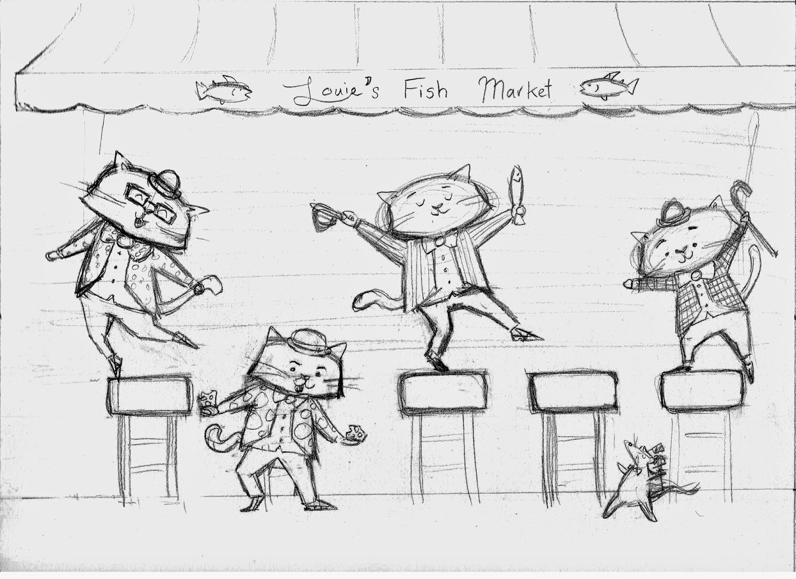
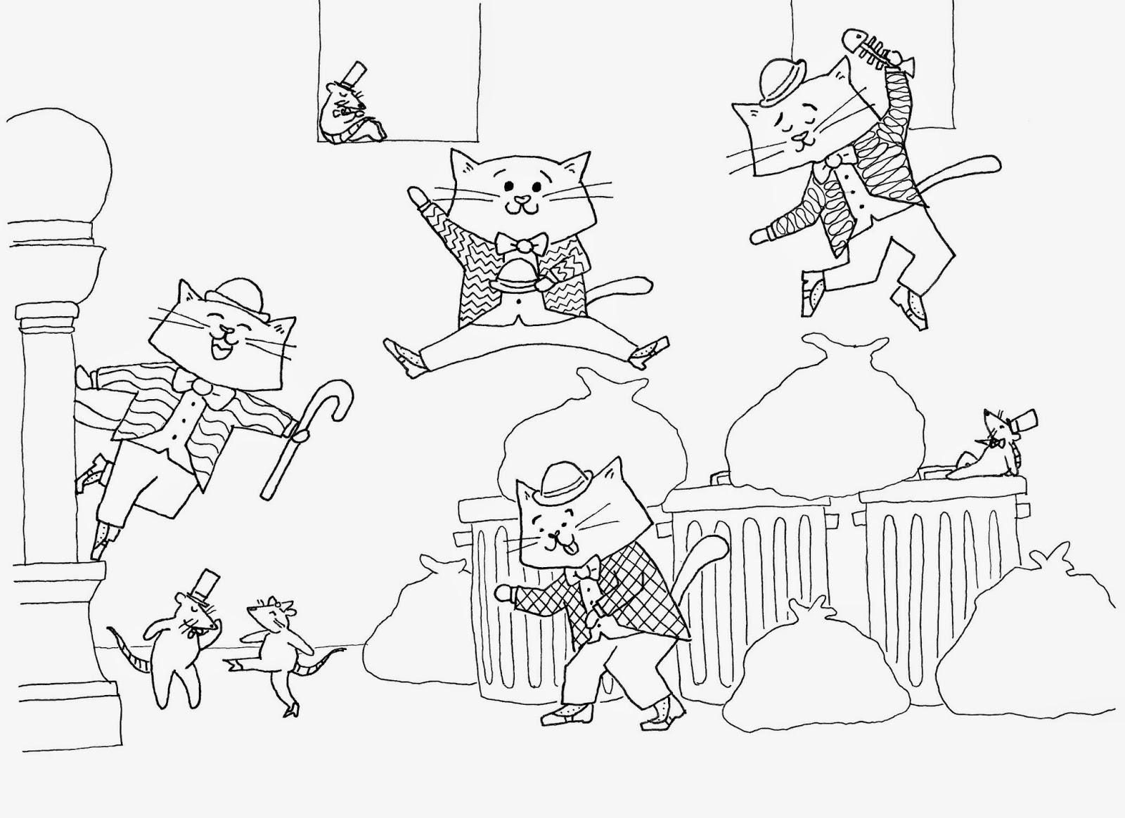
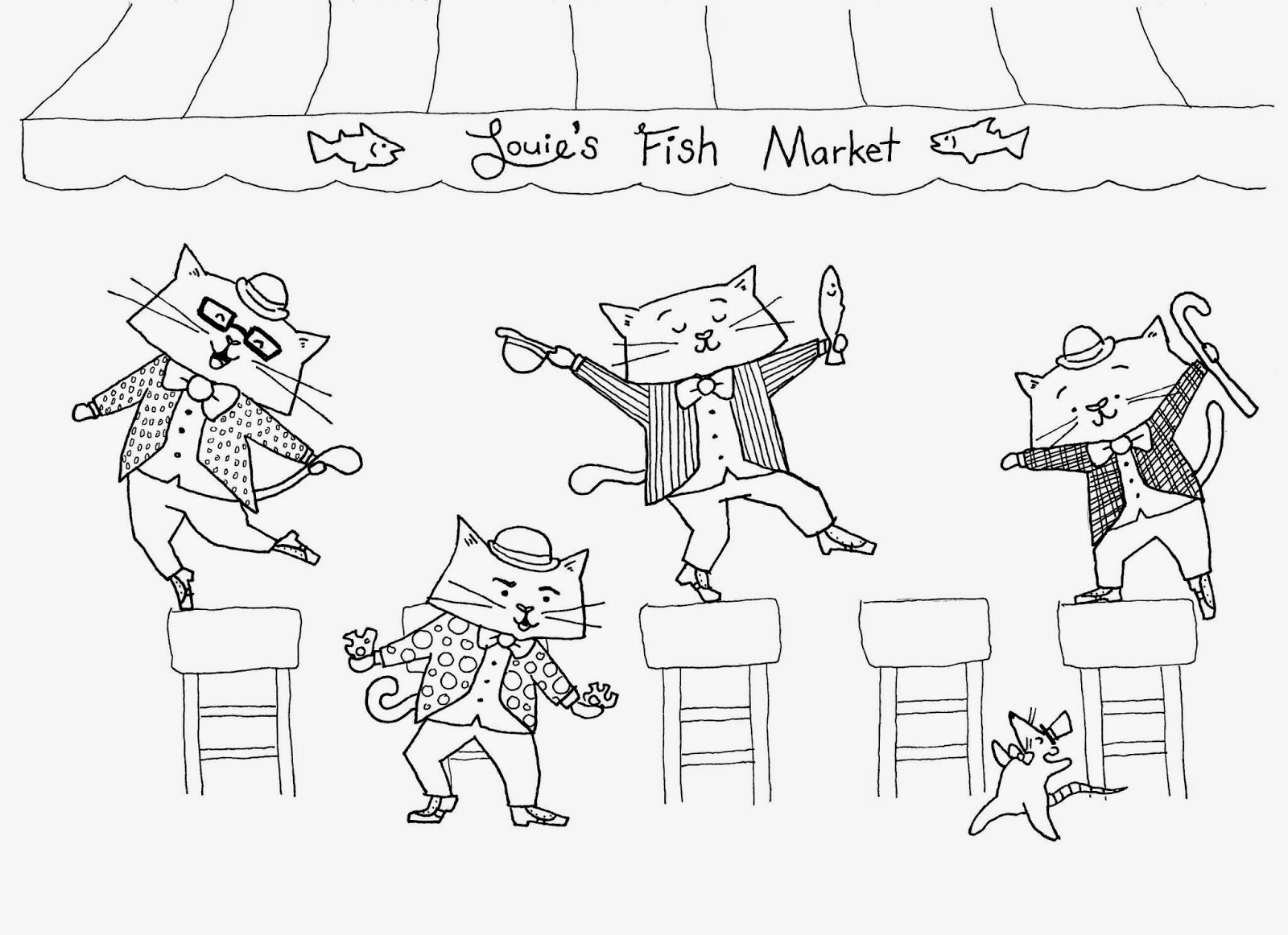
Continuing the week of cuteness, here are more cats (if you need more cats drawings, just scroll through past blog posts). I was supposed to have a finished spread for the SCBWI-Oregon conference, but grad school got in the way, so I only finished the line art. This summer I need to color it in. Of course, nothing I do is going to compare to Jon Klassen’s work, but a girl can dream.
Initial sketch:
Ooligan is not the only rebranding I’ve worked on this term. I wound up reworking one of my own designs for the MAPS team, a group of peer mentors that I am responsible for organizing. Conveniently, this means I can change the look of our brand whenever I want, because I have the power (please read that in a He-Man voice because I think he says that).
Anyway, long story short, I had to update the logo to make it digital-friendly. It lost a bit of it’s character, but it’s sleek-looking! Also, I learned what kerning was.
Original:
Here’s something I did a few months ago for the Independent Publishing Resource Center (IPRC) in Portland. They needed a half-sheet sized catalog cover to promote classes and events offered in February and March of this year. To the surprise of no one who has skimmed through this blog, it features cats.
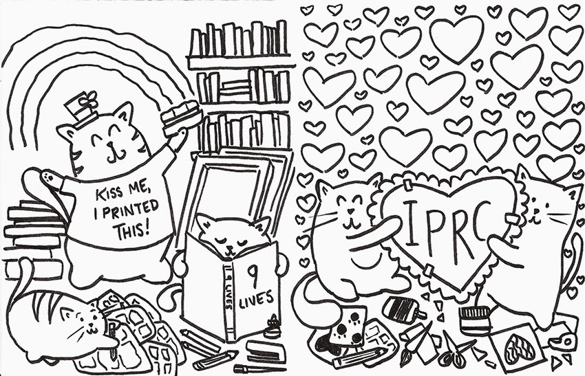
The Valentine’s Day image was the front cover and the St. Patrick’s Day cats occupied the back cover.
To celebrate the end of National Poetry Month, here is a line drawing of one of the all-time greats: Emily Dickinson.

This piece was published in the Winter 2014 edition of the Portland Review, along with a drawing of Edgar Allan Poe (which will show up on the sketch blog in the near future).
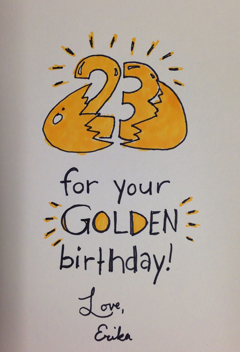
Made this for my sister’s “golden” birthday last fall. I’m glad she understood my weird humor.
 |
| Front of card |
 |
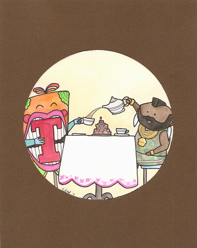
| Inside of card |
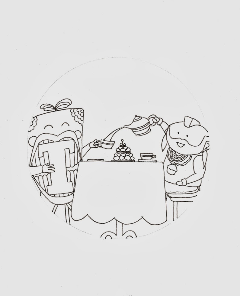 |
| Line art |
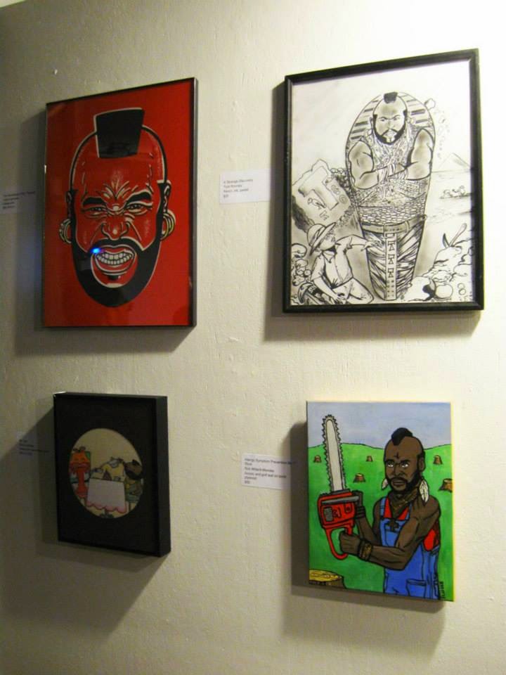 |
| Picture from the show (c/o Ben and Amy Leach) |
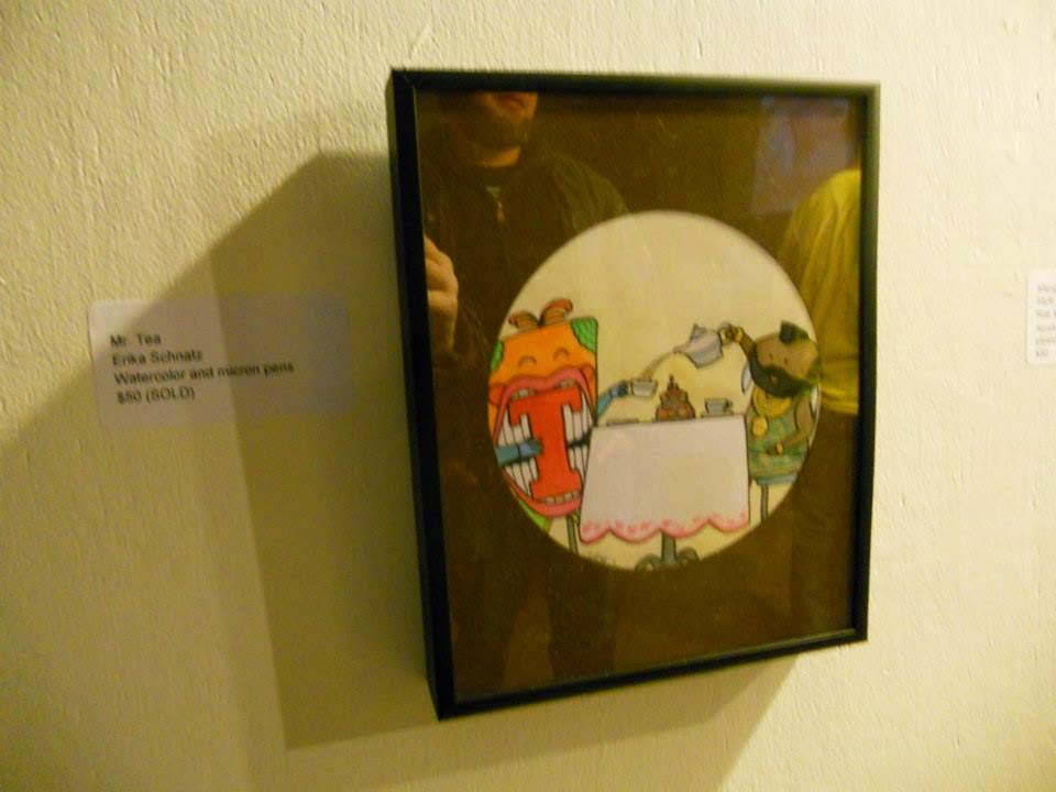 |
| My art on the wall! (c/o Ben and Amy Leach) |
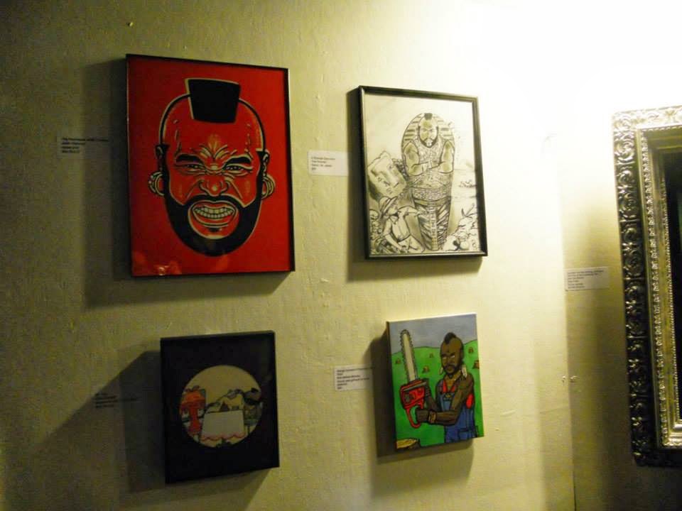 |
| Another view (c/o Ben and Amy Leach) |
