Here Be Dragons!

For my Book Design class this term, I had to design an entire book (it was awesome!) so here are the cover comps I came up with:

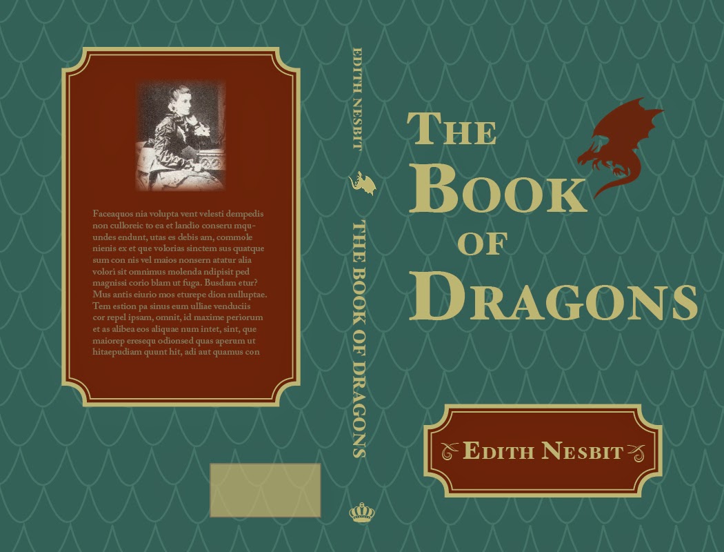
This first one had some nice elements, but it looked a bit old for the target audience of this book (middle-grade level readers).

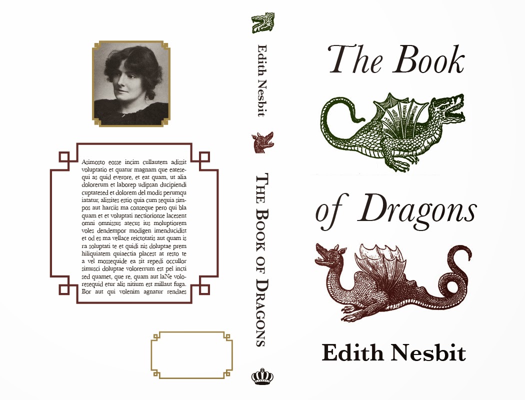
I really liked this design as well, but it looks like an adult book.

This one was the clear favorite of my peers. It was by far the most age appropriate, and since it’s a book for younger audiences, I could get away with having an image-based back cover. The author photo and bio is much more of an adult book element anyway.

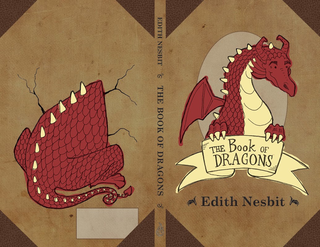
Here’s the final! I made some suggested improvements, like handlettering the text on the cover and adding the dragon’s arms to hold the banner. I obviously redrew the front and back illustrations as well, and added some cracks around the dragon butt to add to the illusion of the dragon breaking through the back of the book cover. My classmates liked where the colors bled outside the lines in the comp, so I replicated that in the final. I moved the ISBN box to a more sensible place as well.

I had some trouble finding reference images for the dragon’s butt, but as multiple people reminded me, dragons aren’t real so I could draw it however I liked.

Ooligan Press Blog Branding

I’ve completed my first year of grad school. Crazy! The next few months are going to be relatively light, responsibility-wise, so expect to see new material pop up in your news feeds on a regular basis. Unless I get really lazy this summer…

Anyway, what follows are some blog badges I created for the student-run publisher I work for, Ooligan Press. We’re working on rebranding the Press and changing up the website, and my silly little doodles are part of it all.

First time around I created everything in Adobe Illustrator, which made everything graphic and clean, but these were missing the hand-drawn/human element that is an integral part of the press’ identity.

These initial badges aren’t bad, but our digital and social media department lead was looking for something that is obviously made by the human hand. So I went back to the drawing board (literally), and came up with these:

You may notice I was roped into creating a few more badges. This is not the last you’ll see of the Ooligan-related work I did this term.

Readin’ with Sasquatch

Here’s the final art for my Powell’s tote bag submission. I really liked it, but it didn’t crack the top 10. Since a very similar idea did make the top 10 (and was way less cute, in my humble opinion) I have a feeling my design was passed over because I didn’t make the Powell’s logo big enough. Whatever! At least I got a nice little portfolio piece out of the contest.

Serve San Francisco T Shirts

My apologies for the lack of posts. I’ve been traveling a lot in the past month and I’ve been slacking on my art stuff. Here’s something I worked on during the past week:
I am currently an AmeriCorps member, and I like to help my peers out when I can. When another member of my program needed help with t shirts, I volunteered my services. Her group is going on several alternative spring break trips, and they need to outfit everyone in t shirts. 
This is an idea from one of the students she works with. It was a basic design for their upcoming trip to San Francisco.
However, I wanted to try and give them something with a little more character than a city skyline. I find that it’s really hard to distinguish city skylines from each other unless there are strong visual indicators (like the Eiffel Tower in Paris), so I wanted to do something else. I drew a cable car, since I associate them with San Francisco.
Above is the basic sketch for the cable car, based on some old travel posters I found on Google.

This is was what I submitted to them for the front of the t shirt.

I didn’t veer very far from their original idea for the back.
So I submitted it, and none of the alternative spring break committee members preferred my cable car design to their idea of the city skyline. So I wound up going back and creating this for them:

Below is a rough idea of what the t shirt will look like:

So there you have it. I learned not to mess with a design idea they really liked, because it cost me time and energy (especially because it was all pro-bono stuff). Meh. I still like my cable car drawing.