Disneyland for Truckers

Disneyland for Truckers digital illustration Erika Schnatz

Getting my master’s degree in book publishing made me realize how much I missed illustration (what I got a degree in the first time around). Now that grad school is over (woo!) there is a bit of downtime while I search for full-time work, so I’ve been emailing art directors looking for illustration jobs.

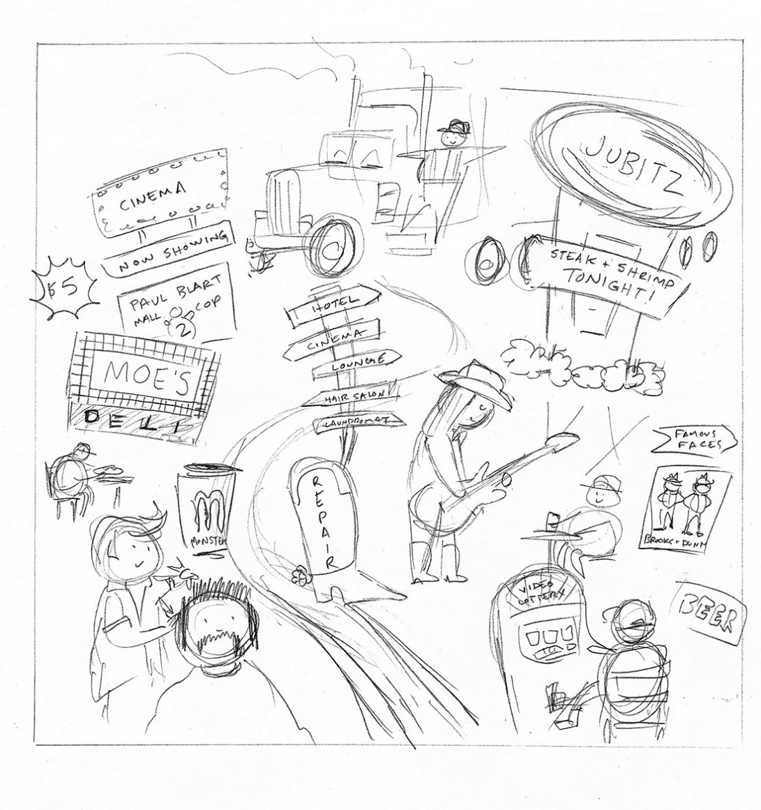
As a result, I snagged an opportunity to work with art director Julie Showers at the Willamette Week, creating an image to go along with a piece about Jubitz truck stops.

Sketch (very similar to the concept sketch Julie sent me):

Disneyland for Truckers sketch Erika schnatz

The digital illustration I submitted (colored completely in Photoshop, which was a new process for me):

Disneyland for Truckers digital illustration  Erika Schnatz

How it looked in print:

Disneyland for Truckers in print Erika Schnatz

They added a bit more red to the illustration (understandably so, as I was probably pushing the limit for the amount of pink in a truck-related image), and messed about with the clouds a bit, but otherwise it looks pretty close to the original.

I was initially told that the text would run above the piece instead of below it, which partly explains the awkward crop at the bottom. Chalk that up to a learning opportunity. In any case, I look forward to working with the Willamette Week again. Editorial pieces are fun because I wind up drawing stuff that I wouldn’t otherwise (like a teeny tiny poster of Brooks & Dunn).

Pabst and Presidents!

It’s been a bit since my last post, mostly because I was doing some last-minute illustration work on this guy:

 It was entered in a Pabst art contest here in Portland at the lovely Grand Central Bowling. The winner was determined by voters, so I was very fortunate to have many of my friends stop by and drop their tickets into my envelope – I won the contest and this image will be transformed into a billboard in Southeast Portland! How awesome is that?!

I’m excited that so many people will see my art! I’m going to brag about it like crazy, since it’s not everyday that your artwork becomes a billboard (unless you work closely with a marketing department, I suppose).

So yay! Here are some images of this work in progress:

The rough sketch that started it all!
The line work for the illustration!

After the PBR cans were colored in (minus the white logo)
All done!

I should have taken some close-ups of the cans – there are many details packed on those cans. Once the billboard is up, I’ll be sure to take more detailed photos!

More Sasquatch!

I’ve been thinking a lot about the Sasquatch because he’s the main component of an image I created for a tote bag design contest at Powell’s books. Here’s my linework for the submission – next week I’ll upload the color version (which is looking pretty adorable so far!)

Week of Lincoln: Day One

This week is Abraham Lincoln’s birthday.

He is my favorite president ever, and sometimes I get bored and draw pictures of him.

I will attempt to post something Lincoln-related every day this week, because he was the man.

Lincoln is a total BAMF. Absolute fact.
I will never draw Lincoln without his stovepipe hat. It is the best type of hat.

Blue Moon

I just realized this post could have been very timely had I posted it the night of the blue moon. However I wasn’t thinking about that, so you’ll get this post now.

I had the pleasure of designing a t-shirt for my high school marching band this year (I also did it last year – I’ll have to find those images for another entry). The theme for their show is “Shadows” and it features “A Night on Bald Mountain”. I watched the Fantasia animated clip for that tune and had a pretty complicated idea in mind involving demons and witches and skeletons. Since I’m a lazy bum I didn’t do much to flesh out the idea, which worked out to my favor, because the band director wanted something involving the moon. They have a backdrop for the field of a giant moon and clouds, so he wanted that idea to translate to the t-shirt.

I figured the idea would be super easy, and I’d whip something out in no time. Not the case my friends. I struggled for a bit before landing on a concept.

First I tried using a photograph of the moon and clouds, and I tooled around with it in Photoshop, but my digital skills are limited and I was frustrated with the results:

Mind you, this is the inverted image because it would be white ink printed on a black t-shirt. I spent way too much time trying to make it work, it was so uninspired. I was also concerned about how well the image would print on a t-shirt, because there are a lot of gray tones in that image that might not come through in a one color print (I took a screenprinting class in college so I have a little bit of experience with setting up silkscreens).

I was also unhappy that I used a photograph. It felt like cheating. I am an illustrator, so anything I do that isn’t drawn out doesn’t feel authentic to me. Cue design disaster number two:

Granted, this isn’t terrible, but I knew the image wasn’t going to translate too well to the screenprinting process. Plus there was no narrative – just a moon and some clouds. I didn’t like this either, but at least I got some practice with Photoshop brushes.
Finally inspiration struck! I was looking at pictures of full moons and I really liked the effect of shadows of objects in front of the moon. It was a really nice framing device. Once I came up with that concept, the rough sketch came out easy peasy.
Visual inspiration.
This is the final result for the front of the t-shirt. I was very happy I was able to add a slightly creepy narrative to the illustration and figure out a way to “ground” the moon.
Here’s the back:

Whew. That was a wordy post. Next time I’ll just post doodles of kittens or something.

Oh yes, one more tidbit of information: all of the images for this shirt were drawn with my Wacom tablet. I almost always scan in a sketch and work on top of it, but this time I drew on blank layers in Photoshop while looking at my sketch. I saved a lot of time by cutting out that middle step. Perhaps I will start doodling on my tablet more often.