Sneaky Peek of Our Super Awesome Wedding Activity Book

Schnatz Duncan Wedding Activity Book

Unless you attended our wedding (hey there immediate family and close friends), you probably haven’t seen this yet. Dan and I co-created a wedding activity book as a gift for our guests, because we enjoy taking on ridiculously complicated projects within short periods of time. Also, what better way to put my master’s in book publishing to use than to design a book?

Schnatz Duncan Wedding Activity Book

Eventually I’ll put up all 24 pages of fun and excellence, but for now you just get to see the cover (which depicts Dan with a burrito and I with a book while riding a giant turquoise HamHam, as you do). However, we have a bunch of printed copies that we’re sending out to all of the lovely folks who sent us a wedding gift, so if you donate to our honeymoon fund and email me your mailing address (schnatze at gmail dot com), you will get a copy of your own!

Did I mention the activity book includes poop emojis? Yeah, we went there.

Disneyland for Truckers

Disneyland for Truckers digital illustration Erika Schnatz

Getting my master’s degree in book publishing made me realize how much I missed illustration (what I got a degree in the first time around). Now that grad school is over (woo!) there is a bit of downtime while I search for full-time work, so I’ve been emailing art directors looking for illustration jobs.

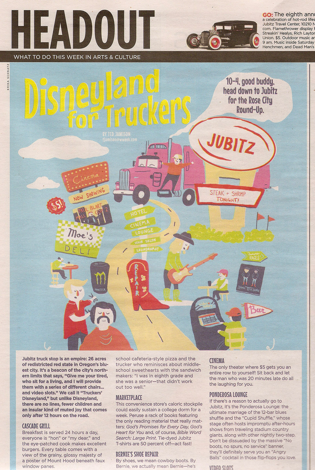
As a result, I snagged an opportunity to work with art director Julie Showers at the Willamette Week, creating an image to go along with a piece about Jubitz truck stops.

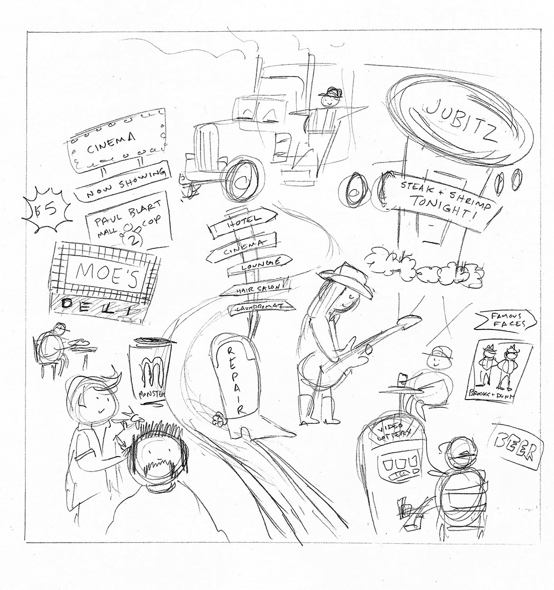
Sketch (very similar to the concept sketch Julie sent me):

Disneyland for Truckers sketch Erika schnatz

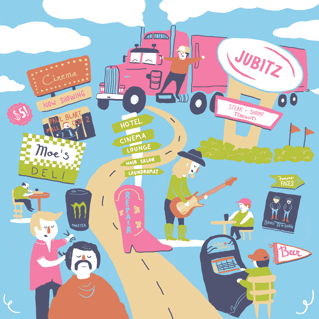
The digital illustration I submitted (colored completely in Photoshop, which was a new process for me):

Disneyland for Truckers digital illustration  Erika Schnatz

How it looked in print:

Disneyland for Truckers in print Erika Schnatz

They added a bit more red to the illustration (understandably so, as I was probably pushing the limit for the amount of pink in a truck-related image), and messed about with the clouds a bit, but otherwise it looks pretty close to the original.

I was initially told that the text would run above the piece instead of below it, which partly explains the awkward crop at the bottom. Chalk that up to a learning opportunity. In any case, I look forward to working with the Willamette Week again. Editorial pieces are fun because I wind up drawing stuff that I wouldn’t otherwise (like a teeny tiny poster of Brooks & Dunn).

Alex Trebek, Omnipresent God

I usually save my comics for Thursday afternoons, but since there was a new Celebrity Jeopardy sketch this weekend on SNL (!!!), here’s an autobiographical comic about the time I tried out for Jeopardy in sixth grade. Please note that my head is full of cats and pizza and not the quadratic equation.

Added bonus: the Celebrity Jeopardy sketch I mentioned earlier!

Jazzy T-Shirt

Let’s get this sketch blog back up and running!

Here’s a t-shirt design I drew for a jazz-related project at Ooligan Press:
It was deemed a little too folksy for a jazz t-shirt, and the style wasn’t quite right for the target demographic, but it’s a nice little composition. Someone brought up Michael Cera when talking about the design, which is a compliment of the highest order for me. I loved Juno. :)
The black and white drawing is below:

Dam Good Books

Here’s another little thing I whipped up for Ooligan Press:

I offered a beaver-less option if the press wanted to be a bit more high-brow, but I’m happy to see the little guy made the cut.

Ooligan Press is putting together “Dam Book Bundles” – basically a collection of 3 titles that our press has published. The titles are offered at a discount because you’re buying multiple books. It’s a pretty sweet deal, and you can check it out here if you want to buy some excellent titles from a student-run independent press. Check it out for the puns alone!

Here Be Dragons!

For my Book Design class this term, I had to design an entire book (it was awesome!) so here are the cover comps I came up with:

This first one had some nice elements, but it looked a bit old for the target audience of this book (middle-grade level readers).

I really liked this design as well, but it looks like an adult book.

This one was the clear favorite of my peers. It was by far the most age appropriate, and since it’s a book for younger audiences, I could get away with having an image-based back cover. The author photo and bio is much more of an adult book element anyway.

Here’s the final! I made some suggested improvements, like handlettering the text on the cover and adding the dragon’s arms to hold the banner. I obviously redrew the front and back illustrations as well, and added some cracks around the dragon butt to add to the illusion of the dragon breaking through the back of the book cover. My classmates liked where the colors bled outside the lines in the comp, so I replicated that in the final. I moved the ISBN box to a more sensible place as well.

I had some trouble finding reference images for the dragon’s butt, but as multiple people reminded me, dragons aren’t real so I could draw it however I liked.