Comics Jam

My sincerest apologies for taking forever to post. Mea culpa.

To make up for it, today you get not one, but THREE comics. Of which I drew a third. So in total I drew one comic, but I drew panels in three different comics. It’s confusing, but you’ll see what I’m talking about in a minute.

The comics jam (or whatever you want to call it) was part of the first meeting of a comics-drawing collective I started in order to coerce me into drawing more. Our first meeting had 3 members, but after seeing these amazing comics, we’re going to have more people at our next meeting. I know it.

Each of us started a 9-panel comic and assigned a rule to the comic. We had 3 minutes to draw our panel then had to switch comics after time expired. As a result, each member drew 3 panels in each of the comics.

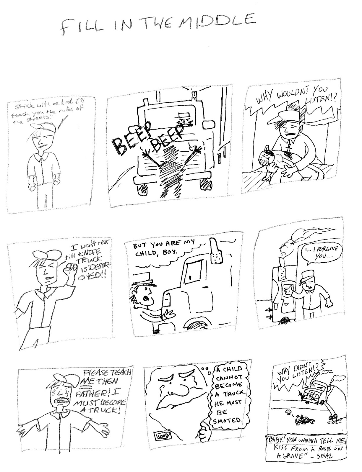
“Fill in the Middle” by Dan Duncan, Shane Hosea & Erika Schnatz

Dan started this one. He drew the first panel, Shane drew the third panel, and I had to draw the panel in the middle. It got really crazy really fast. Notice how the truck becomes anthropomorphic halfway through the comic!

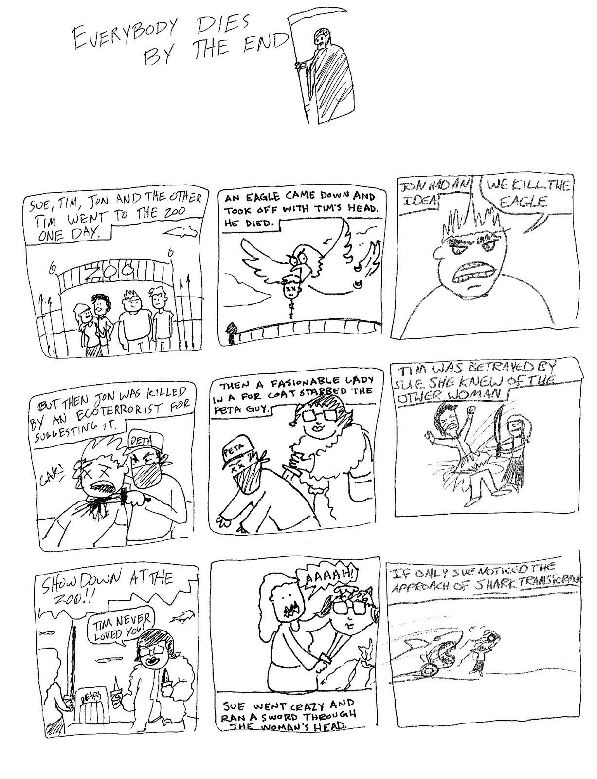
“Everybody Dies by the End” by Shane Hosea, Erika Schnatz & Dan Duncan

Shane’s rule for this comic was that everyone needed to die by the end. As you see, it didn’t take long for us to start killing off characters. Shane drew the 1st panels, I drew the middle panels, and Dan drew the 3rd panels. The Shark Transformer is a stupid idea/theme song I made up in the shower earlier that day. I’m glad it was incorporated into the comic.

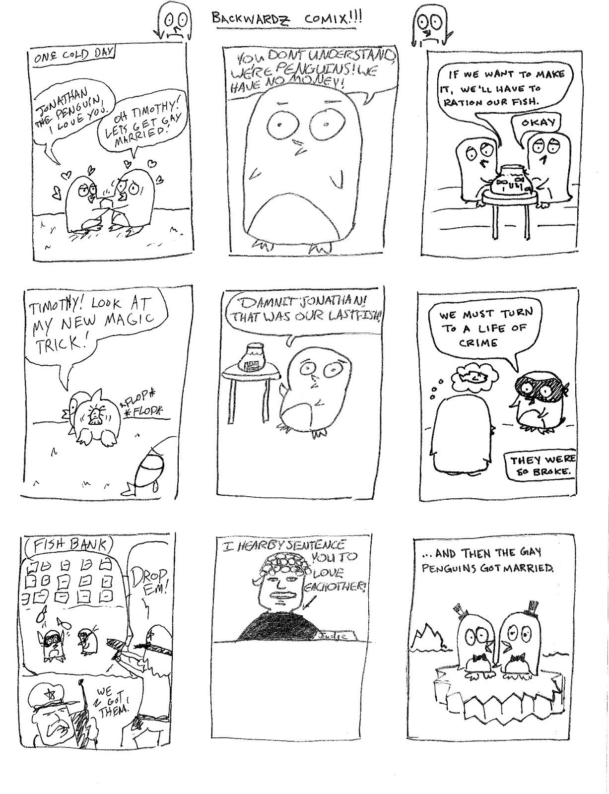
“Backwardz Comix!!! (Gay Penguins)” by Erika Schnatz, Dan Duncan & Shane Hosea

I started this comic, and we drew this story backwards. I love this story so much. I drew the 3rd panels, Dan drew the center panels, and Shane drew the 1st panels. We had to pause drawing for a minute or two because I couldn’t stop laughing after the “Timothy! Look at my new magic trick” panel.

I can’t wait to do this again. It was crazy fun.

Blue Moon

I just realized this post could have been very timely had I posted it the night of the blue moon. However I wasn’t thinking about that, so you’ll get this post now.

I had the pleasure of designing a t-shirt for my high school marching band this year (I also did it last year – I’ll have to find those images for another entry). The theme for their show is “Shadows” and it features “A Night on Bald Mountain”. I watched the Fantasia animated clip for that tune and had a pretty complicated idea in mind involving demons and witches and skeletons. Since I’m a lazy bum I didn’t do much to flesh out the idea, which worked out to my favor, because the band director wanted something involving the moon. They have a backdrop for the field of a giant moon and clouds, so he wanted that idea to translate to the t-shirt.

I figured the idea would be super easy, and I’d whip something out in no time. Not the case my friends. I struggled for a bit before landing on a concept.

First I tried using a photograph of the moon and clouds, and I tooled around with it in Photoshop, but my digital skills are limited and I was frustrated with the results:

Mind you, this is the inverted image because it would be white ink printed on a black t-shirt. I spent way too much time trying to make it work, it was so uninspired. I was also concerned about how well the image would print on a t-shirt, because there are a lot of gray tones in that image that might not come through in a one color print (I took a screenprinting class in college so I have a little bit of experience with setting up silkscreens).

I was also unhappy that I used a photograph. It felt like cheating. I am an illustrator, so anything I do that isn’t drawn out doesn’t feel authentic to me. Cue design disaster number two:

Granted, this isn’t terrible, but I knew the image wasn’t going to translate too well to the screenprinting process. Plus there was no narrative – just a moon and some clouds. I didn’t like this either, but at least I got some practice with Photoshop brushes.
Finally inspiration struck! I was looking at pictures of full moons and I really liked the effect of shadows of objects in front of the moon. It was a really nice framing device. Once I came up with that concept, the rough sketch came out easy peasy.
Visual inspiration.
This is the final result for the front of the t-shirt. I was very happy I was able to add a slightly creepy narrative to the illustration and figure out a way to “ground” the moon.
Here’s the back:

Whew. That was a wordy post. Next time I’ll just post doodles of kittens or something.

Oh yes, one more tidbit of information: all of the images for this shirt were drawn with my Wacom tablet. I almost always scan in a sketch and work on top of it, but this time I drew on blank layers in Photoshop while looking at my sketch. I saved a lot of time by cutting out that middle step. Perhaps I will start doodling on my tablet more often.