Where Comics + Children’s Books Collide

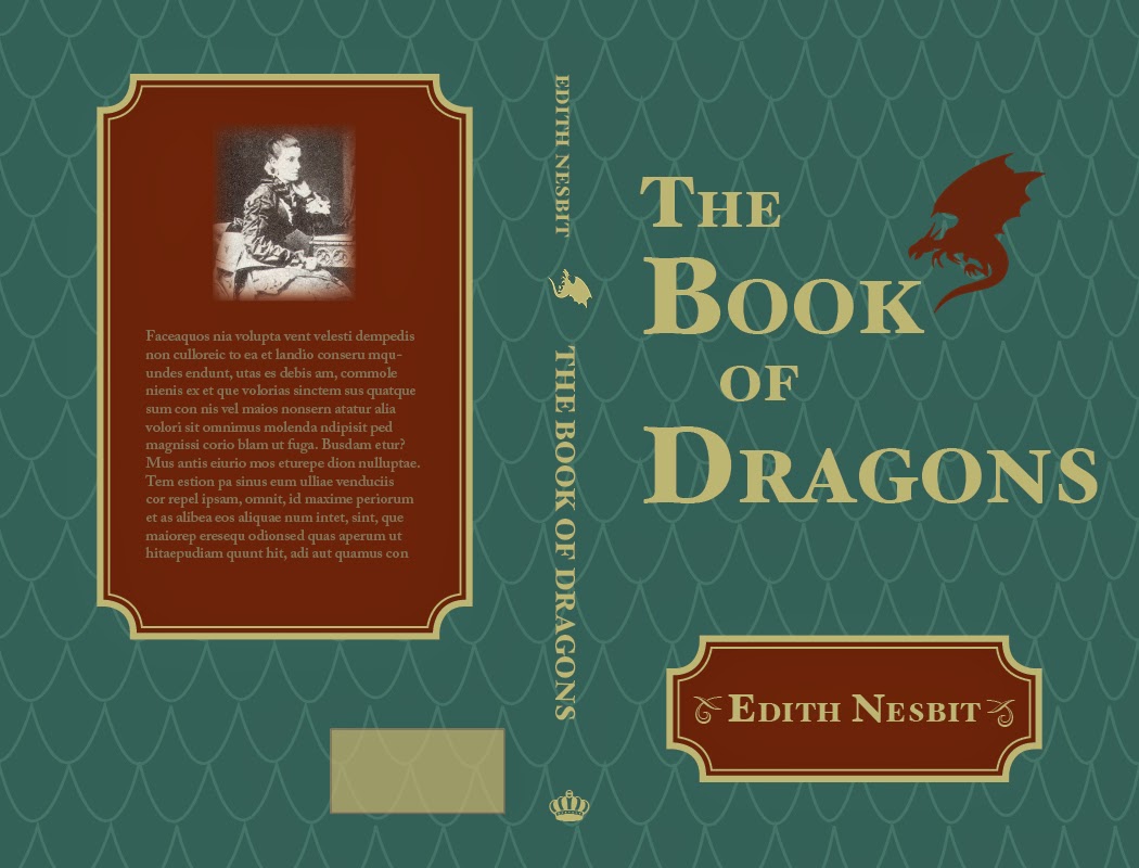
I recently visited Portland State’s campus to pick up a copy of some books that I helped design this past year, and discovered that my master’s thesis has been downloaded by a bunch of folks since it was uploaded to PDX Scholar at the end of August. Apparently people want to read about the intersection between comics and children’s books! Maybe you would like to read it?

Here’s the abstract to whet your interest:

When did speech bubbles first appear in children’s picture books? In what ways have speech bubbles been co-opted from comic books to serve picture book narratives? What does this example suggest about the future of children’s books co-opting the visual language of comic books? The visual language of comics has slowly permeated American popular culture since the first regular newspaper strip, Richard Felton Outcault’s The Yellow Kid, back in 1895. From the onomatopoetic visuals in the campy ‘60s Batman television series and pop art paintings of Roy Lichtenstein, to the never-ending string of superhero-based blockbuster movies today, comics have been co-opted and adapted to almost every medium imaginable. One area slow to embrace the visual language of comics is perhaps the most similar in form in terms of its relationship between words and images: the children’s picture book. A closer look at the historically poor reception of comics by the gatekeepers of children’s literature will illuminate the tension between comics and picture books, and underscore the innovation of fusion texts that meld elements from comics with picture books.

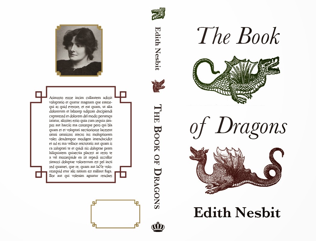
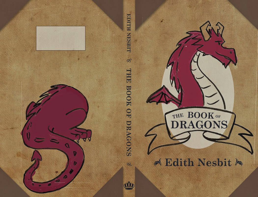
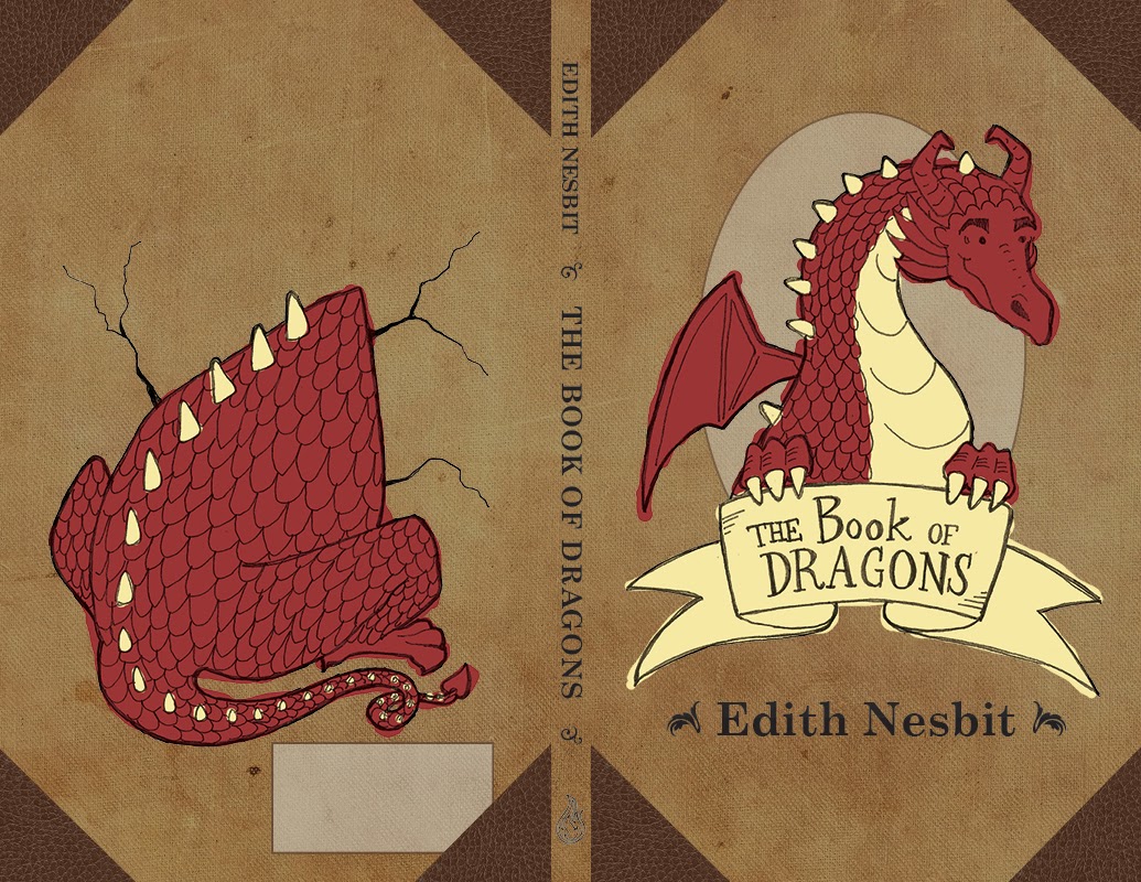
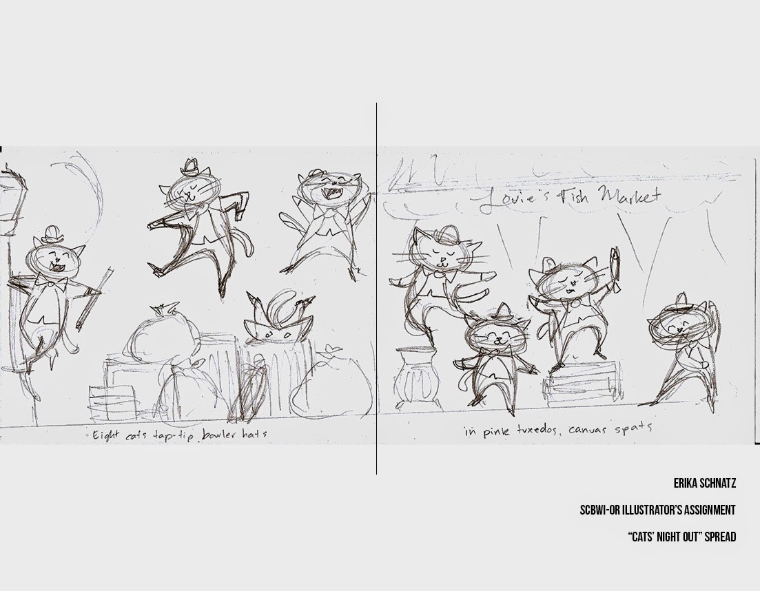
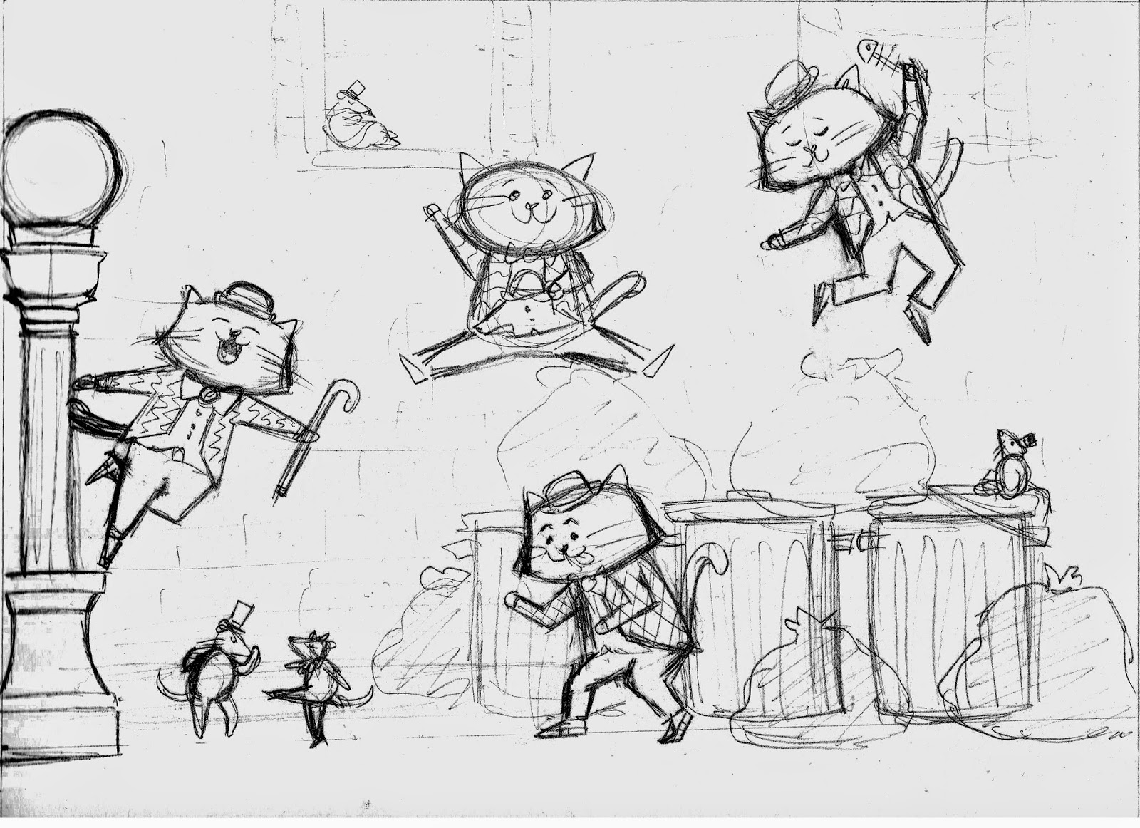
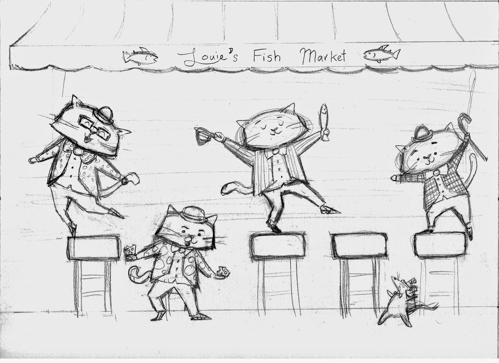
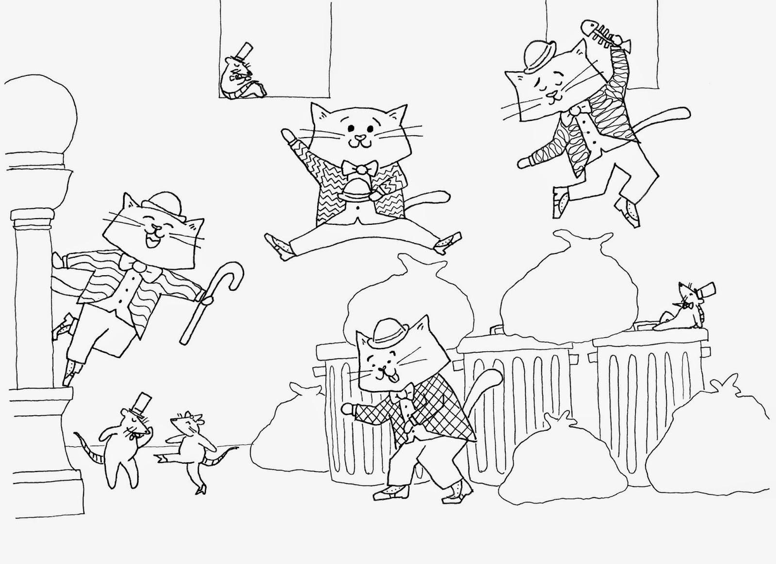
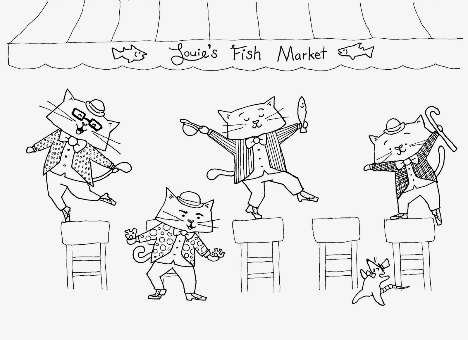
If you’d like to download the paper and read it (it’s got lots of pictures, as I am a visual person at heart), you can find it on PDX Scholar here: linky link.

New Story in the Works

Gentleman Walrus Sketch Erika Schnatz

It’s been some time since I’ve worked on a children’s book idea, so today my goal is to draft a story for this proper gentleman:

Gentleman Walrus Sketch Erika Schnatz

He was a character I created for another writer’s manuscript in my children’s book publishing course, and I really enjoyed drawing him. It’s likely he’ll evolve a great deal over the drafting and revision processes, but I’m looking forward to writing a story around a character. Should be fun!

Here are a few more images of him from the dummy children’s book I created:

Gentleman Walrus Sketch Erika Schnatz

Gentleman Walrus Sketch Erika Schnatz

With a face like that, wacky hijinks are sure to ensue.

Here Be Dragons!

For my Book Design class this term, I had to design an entire book (it was awesome!) so here are the cover comps I came up with:

This first one had some nice elements, but it looked a bit old for the target audience of this book (middle-grade level readers).

I really liked this design as well, but it looks like an adult book.

This one was the clear favorite of my peers. It was by far the most age appropriate, and since it’s a book for younger audiences, I could get away with having an image-based back cover. The author photo and bio is much more of an adult book element anyway.

Here’s the final! I made some suggested improvements, like handlettering the text on the cover and adding the dragon’s arms to hold the banner. I obviously redrew the front and back illustrations as well, and added some cracks around the dragon butt to add to the illusion of the dragon breaking through the back of the book cover. My classmates liked where the colors bled outside the lines in the comp, so I replicated that in the final. I moved the ISBN box to a more sensible place as well.

I had some trouble finding reference images for the dragon’s butt, but as multiple people reminded me, dragons aren’t real so I could draw it however I liked.

Dancing Cats

Continuing the week of cuteness, here are more cats (if you need more cats drawings, just scroll through past blog posts). I was supposed to have a finished spread for the SCBWI-Oregon conference, but grad school got in the way, so I only finished the line art. This summer I need to color it in. Of course, nothing I do is going to compare to Jon Klassen’s work, but a girl can dream.

Initial sketch:

The text from the spread I picked to illustrate: 
“Eight cats tap…tip bowler hats in pink tuxedos, canvas spats”
Left page refined sketch:
Right page refined sketch:
Left page line art:
Right page line art:

Mr. Tea

A fun 80s mashup between Mr. T (who pities fools) and Mr. T (who has tall teeth) at a tea party (naturally). This piece was part of “Jibbart Jabbart: A Mr. T-Themed Art Show & Experience” at the PhilaMOCA in Philadelphia.
Line art

Picture from the show (c/o Ben and Amy Leach)

My art on the wall! (c/o Ben and Amy Leach)

Another view (c/o Ben and Amy Leach)