How to Design A Book Cover for Ooligan Press

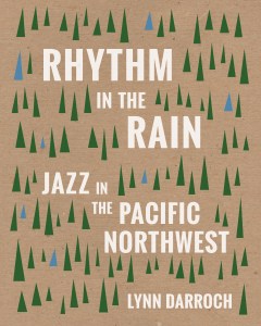
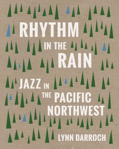
Rhythm in the Rain Final Front Cover Erika Schnatz

The idiom goes, “Don’t judge a book by its cover.” As someone who has created a handful of cover designs, I say, judge away. If the cover design is effective, it will help sell the book.

Many publishers have a designer or teams of designers on staff to tackle book cover design, but since Ooligan Press is a teaching press, it relies on its students to take cover concepts from brainstorm to final files. Under the helpful guidance of the Design & Production Manager (my role during the 2014-2015 academic year) and a weekly peer critique, students design each book published at the press.

The cover design process at Ooligan is democratic; students who attend the design meetings vote for the top three cover concepts, then the whole press votes on which design will make it to print. After designing a number of concepts that didn’t quite make the cut, one of my concepts was chosen as the final cover for Rhythm in the Rain: Jazz in the Pacific Northwest (woo!). Here is how the process went:

  1. Read the design brief: the project team working on the book puts together a design brief with the assistance of the design manager and then it’s sent out to the entire press via email. Since there was no manuscript available to peruse (normally step 2), the design brief was doubly important.
  2. Brainstorm! If you’re like me, this means some pencil-on-paper action to play with shapes, concepts, and overall composition before/after/during a search for design inspiration. And writing teeny tiny notes to yourself.

Rhythm in the Rain cover comps Erika Schnatz

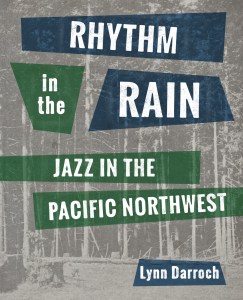
3. Make some mock-ups: Time to hop on the computer and create some comps. These are the initial three designs I brought to our peer critique:

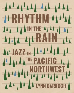
4. Revision, revision, revision: My peers responded most positively to design #2, so I took their feedback and ran with it, to produce the following variations:

5. Cover vote! After a few weeks of revision time, the design team voted on three cover concepts to go in front of the entire press. My design was one of the three, and I believe the first cover above was the one I chose to show (I hadn’t had time to make too many adjustments in the prior weeks). We received some feedback from the author on the final three cover concepts, and members of the press chimed in with their own thoughts. Some of it was useful and some of it was not. It was pointed out to me that the bark texture in the background was a bit arbitrary (I agreed). The final vote was tallied, my concept was chosen, and it was time to get back to work:

From this point on design decisions were made by the publisher, the project manager, and myself. When I sent out these variations, the third version was the clear standout. From there it was a series of very small nitpicky design changes, like moving trees around and playing with the background color of the cover.

Rhythm in the Rain Final Front Cover Erika Schnatz

6. Finish it: Once a front cover was agreed upon, it was time to design the spine and back cover. The back cover will inevitably change a bit before the book is printed based on the blurbs and book summary, so I had some fun with the placeholder quotes in the meantime. Voilà!

Rhythm in the Rain Final Full Cover Erika Schnatz

(Since Esperanza Spalding is one of the most well-known jazz figures in the Pacific Northwest, she turned into something of an inside joke. Sorry, Esperanza!) If you need a design for your next book, I’m available!

Adulting it Up

Pound Foolish by Helaine Olen

Today I’m veering from the sketch blog norm to share some resources I’ve found helpful on my ongoing quest to get my sh*t together. I’m (mostly) using my downtime for productive, adult-type things (especially since I’m done with wedding planning — yay marriage!), so here are some things I can vouch for:

Podcasts (to listen to while you’re home alone job hunting while your significant other is at work):

  • Call Your Girlfriend: A nice mix of pop culture, current events, and helpful lady resources through a feminist lens, hosted by long distance best friends Ann Friedman and Aminatou Sow (two ladies who really have their sh*t together)
  • How to Be Amazing with Michael Ian Black: MIB does a stellar job getting well-known folk like Bob Odenkirk and Amy Schumer to narrate how they got where they are today
  • 99% Invisible: Cool stories regarding the design behind things we take for granted (like the PDX airport carpet!) — I’ve learned many bits of possibly useful trivia from this podcast
  • The Deep End Design: Just started listening to this one yesterday, and it is full of super duper helpful advice for designers like how to set your rates and what to include in your online portfolio
  • Money Girl’s Quick and Dirty Tips for a Richer Life: Short (10-20 minute) episodes that provide practical information on money matters, like how to improve your credit score and other things I should have learned a long time ago

Websites (to up your adult game):

  • The Muse: I enjoy their email newsletter – lots of quick and easy tips to make the job hunt less of a living hell. Their advice on how to answer the most common interview questions has been particularly helpful for me
  • DailyWorth: Financial and career advice for the ladies! Some/many of the articles are clickbait-y, but sometimes you just need a good listicle to encourage you to save money and dream about a house you can’t afford
  • Red Lemon Club: Good information for graphic designers and other creative folk regarding the business side of things, plus the logo is cute

A Book (to enhance your knowledge of grown-up issues):

  • Pound Foolish: Exposing the Dark Side of the Personal Finance Industry by Helaine Olen: As someone who knew very little about personal finances prior to reading this book (one of the many reasons I picked it up), this was an engaging, thought-provoking read about all of the people who are making bank by exploiting the people who don’t know what to do with their money. I thoroughly enjoyed reading Pound Foolish, and it has prompted me to seek out more personal finance resources so I can do a better job of managing the household moneys.

An irregularly scheduled sketch blog post (with pictures!) will return on Thursday.

Ooligan Press Blog Branding

I’ve completed my first year of grad school. Crazy! The next few months are going to be relatively light, responsibility-wise, so expect to see new material pop up in your news feeds on a regular basis. Unless I get really lazy this summer…

Anyway, what follows are some blog badges I created for the student-run publisher I work for, Ooligan Press. We’re working on rebranding the Press and changing up the website, and my silly little doodles are part of it all.

First time around I created everything in Adobe Illustrator, which made everything graphic and clean, but these were missing the hand-drawn/human element that is an integral part of the press’ identity.

These initial badges aren’t bad, but our digital and social media department lead was looking for something that is obviously made by the human hand. So I went back to the drawing board (literally), and came up with these:

You may notice I was roped into creating a few more badges. This is not the last you’ll see of the Ooligan-related work I did this term.

Readin’ with Sasquatch

Here’s the final art for my Powell’s tote bag submission. I really liked it, but it didn’t crack the top 10. Since a very similar idea did make the top 10 (and was way less cute, in my humble opinion) I have a feeling my design was passed over because I didn’t make the Powell’s logo big enough. Whatever! At least I got a nice little portfolio piece out of the contest.

More Sasquatch!

I’ve been thinking a lot about the Sasquatch because he’s the main component of an image I created for a tote bag design contest at Powell’s books. Here’s my linework for the submission – next week I’ll upload the color version (which is looking pretty adorable so far!)