Giraffes!

This was a project I completed earlier this year for my dear friend Kayla (who is sort of famous). The girl has got some pipes. But I digress.

Kayla’s close friend just had a baby, and Kayla wanted a special card made for the family. Specifically, she wanted a family of giraffes. When I finally got down to drawing it out (I procrastinate heavily without concrete deadlines), it didn’t take me very long. I drew out one rough sketch to show Kayla:

The finished art looks pretty similar. I got a little crazy with Momma Giraffe’s hair, but it’s a good look for her.
And here’s what the card looks like:

All I used for this card was some Micron pens I think. Some kind of pens. I don’t quite remember.

Robots

As I mentioned in my last post, I was (sort of) working on a little robot art piece. Since I pulled out all the stops at the last minute and manage to finish the piece, I can triumphantly post about it.

Background:
Robo Taco (a Mexican eatery in SE Portland) put out a call for robot art on Craigslist (a totally reputable site to find art jobs) and I saved the post – thinking that I might get around to creating a piece. Usually, I don’t, but this time, dear reader, I did! I made a rough sketch of what I wanted my little robot to look like one evening, and the following evening I drew it out on nice paper, inked it and watercolor-d it, and Mod Podge-d it all together.

So here is the rough sketch:

And here is the finished product:

I put it in a frame I got from Goodwill for $2, and voila! A finished piece. It looks pretty classy in the frame, but I don’t have a picture of that yet.

Materials used: Watercolor paper, Micron pens, watercolors, colored pencils, and patterned scrapbook paper (the background)

A Lady & Her Pup

Here’s a quick post before I kick off my weekend:

We had a gift exchange in the AmeriCorps program I was in last year (we were a pretty tight-knit bunch) and I think there was a max of $5 you could spend since we were all broke and that sort of restriction leads to thoughtful, handmade gifts. (Which it totally did).

I had some small frames from IKEA that I wasn’t using for anything, so I spray painted them black and made some pen drawings to go inside of them. I figured most people would dig pictures of themselves (I adore a portrait of myself that was done in Paris – even more so because I’ve had to draw myself a countless number of times for self-portrait projects) and pictures of their pets. This particular lady was the first AmeriCorps member I met in Oregon because she let me and my boyfriend crash at her place for a few days before I moved into my house. She has a super cute dog named Pablo, and my then-boyfriend bonded with Pablo because he loves all dogs. I realize I’m getting off track now, so here are the pictures:

I apologize to Megan for this portrait – it does look like her but I did not crop this image well. It makes her look much less cute than she is in real life because of the way I cut her chin out of the picture. I did a much better job with Pablo:

Such a cute puppy!

I think these were drawn with Micron pens, but I can’t quite remember. Woo!

Scribbly Doodles

My life has been a smidgen crazy recently. I’m at the beginning of a lot of great things, and I haven’t had much time to draw as a result (I will be fixing that soon!). I found these creature doodles in a notepad and felt they warranted a post. I drew them last year during the before-school reading program I ran at an elementary school. We had a volunteer reader come in on Wednesday mornings, which gave me a bit of time to draw. Of course, the kids always wanted to see what I drew at the end of the session. Sometimes they tried to draw the same thing. It was pretty cute.

I have more of those early morning doodles stashed away, so I’ll scan them in at some point.

I love the crazy-eyed vulture-looking guy at the bottom of the page.

This doodle makes me very happy. It is the most Quentin Blake-ish thing I’ve ever drawn. (Quentin Blake did the interior illustrations for the majority of Roald Dahl’s books, for those of you who don’t have an expansive knowledge of children’s book illustrators).

These were drawn with some felt-tip pen I acquired at school. I think I pilfered a few of them from the supply cabinet because I really liked making lists and drawing with them.

Blue Moon

I just realized this post could have been very timely had I posted it the night of the blue moon. However I wasn’t thinking about that, so you’ll get this post now.

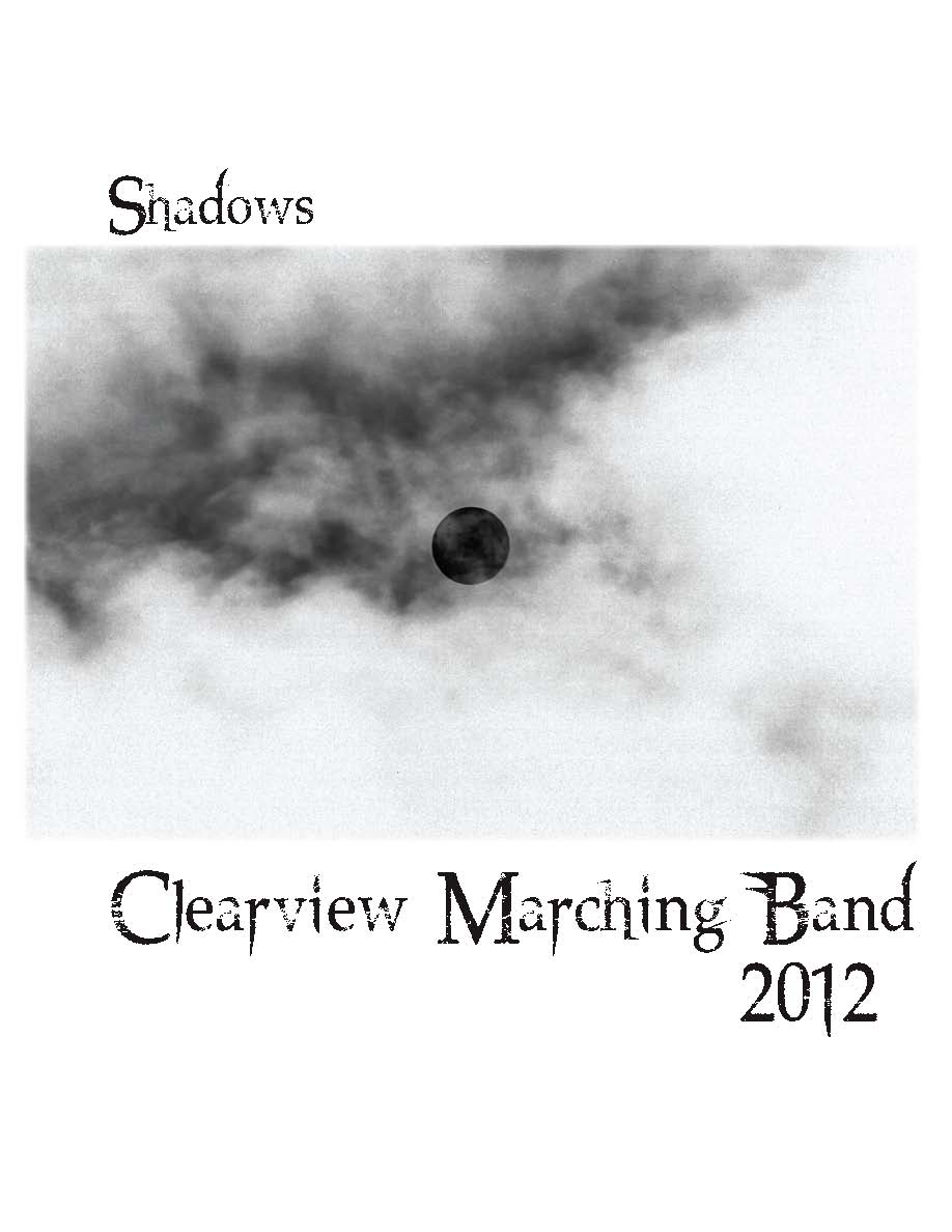
I had the pleasure of designing a t-shirt for my high school marching band this year (I also did it last year – I’ll have to find those images for another entry). The theme for their show is “Shadows” and it features “A Night on Bald Mountain”. I watched the Fantasia animated clip for that tune and had a pretty complicated idea in mind involving demons and witches and skeletons. Since I’m a lazy bum I didn’t do much to flesh out the idea, which worked out to my favor, because the band director wanted something involving the moon. They have a backdrop for the field of a giant moon and clouds, so he wanted that idea to translate to the t-shirt.

I figured the idea would be super easy, and I’d whip something out in no time. Not the case my friends. I struggled for a bit before landing on a concept.

First I tried using a photograph of the moon and clouds, and I tooled around with it in Photoshop, but my digital skills are limited and I was frustrated with the results:

Mind you, this is the inverted image because it would be white ink printed on a black t-shirt. I spent way too much time trying to make it work, it was so uninspired. I was also concerned about how well the image would print on a t-shirt, because there are a lot of gray tones in that image that might not come through in a one color print (I took a screenprinting class in college so I have a little bit of experience with setting up silkscreens).

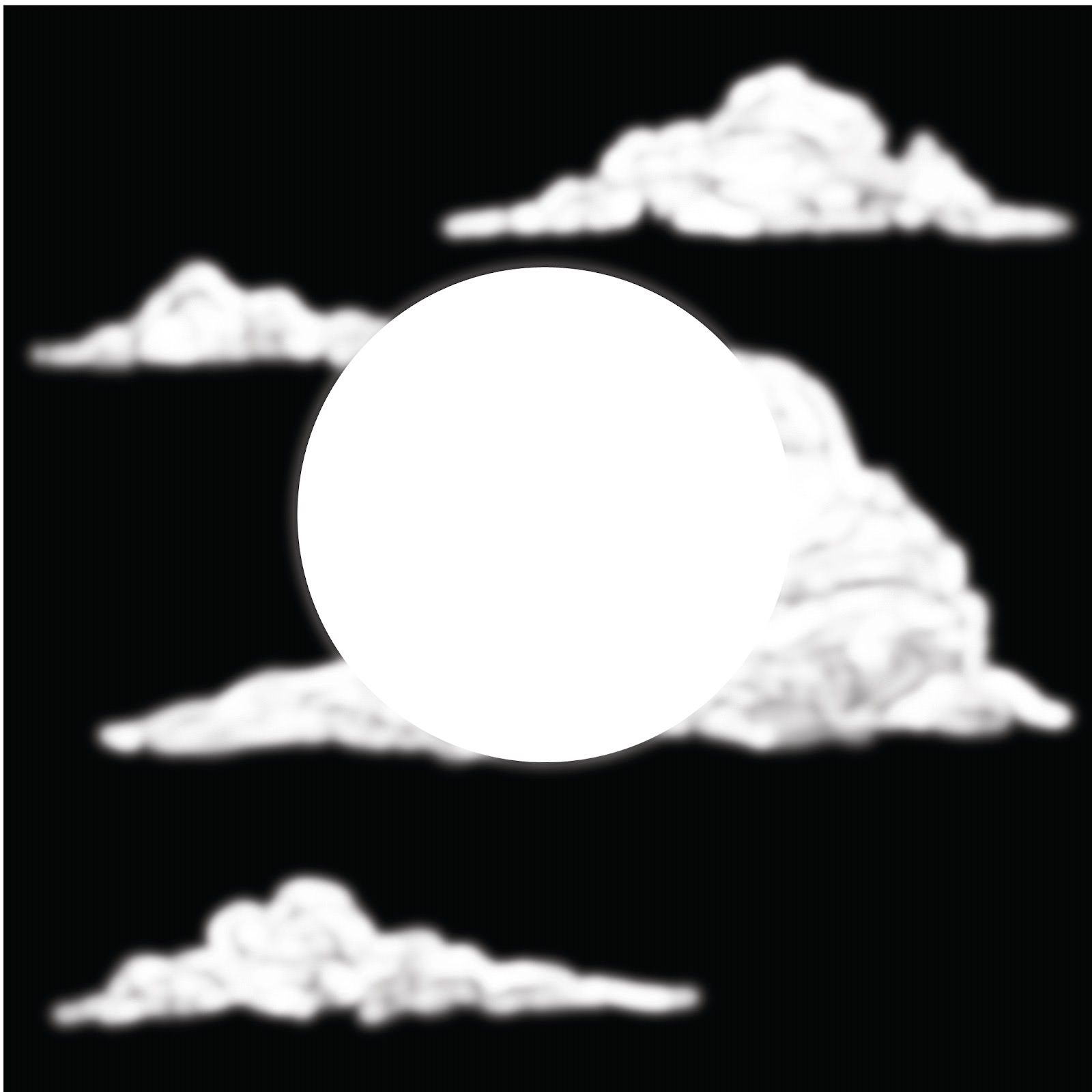
I was also unhappy that I used a photograph. It felt like cheating. I am an illustrator, so anything I do that isn’t drawn out doesn’t feel authentic to me. Cue design disaster number two:

Granted, this isn’t terrible, but I knew the image wasn’t going to translate too well to the screenprinting process. Plus there was no narrative – just a moon and some clouds. I didn’t like this either, but at least I got some practice with Photoshop brushes.
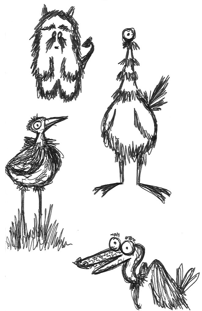
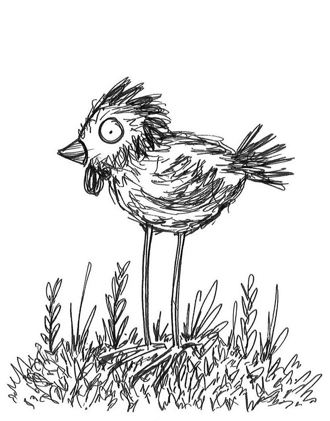
Finally inspiration struck! I was looking at pictures of full moons and I really liked the effect of shadows of objects in front of the moon. It was a really nice framing device. Once I came up with that concept, the rough sketch came out easy peasy.
Visual inspiration.
This is the final result for the front of the t-shirt. I was very happy I was able to add a slightly creepy narrative to the illustration and figure out a way to “ground” the moon.
Here’s the back:

Whew. That was a wordy post. Next time I’ll just post doodles of kittens or something.

Oh yes, one more tidbit of information: all of the images for this shirt were drawn with my Wacom tablet. I almost always scan in a sketch and work on top of it, but this time I drew on blank layers in Photoshop while looking at my sketch. I saved a lot of time by cutting out that middle step. Perhaps I will start doodling on my tablet more often.

Wonder Wolf!

I can only tenuously connect this post to the Olympics, but I’ve been thinking about the Olympics, so deal with it.

This little guy is the Wonder Wolf. As you may (or may not) know, I worked in an elementary school in Beaverton, OR for the past school year (near Nike headquarters – Olympics connection) and the school mascot was the Wonder Wolf. I actually dressed up in that costume a handful of times, unfortunately there is no photographic evidence of this…

Anyway, I made thank you cards for student volunteers and teachers at the end of the year, so I drew a cartoony little wolf. He’s got an apple to signify education, and a little cape to do awesome deeds in.

I let some of the kids color in the cards before I handed them out – I’ll have to see if I can find one to scan in and put up here.

There was no real connection to the Olympics here, although I think the Wonder Wolf would make a pretty great Olympic mascot. Better than that weird blue thing for the Atlanta Olympics in the 90s. What was that thing?

More Monkey Business…

To continue on the theme of my initial post, here is another card that also involves a monkey. Specifically, party monkey.

This was for my brother’s 18th birthday. You can never be too old for monkey cards.

I think I used the same photo reference for this card and the party monkey on the last card. Months and months apart. Weird.

Materials used: Watercolor (very muted), some kind of pen, Artists’ ink & little brushes

Firsties.

So after having this blog set up for ages, I’m finally going to start posting on here regularly. Probably.

To kick things off, here are some drawings of monkeys. They were for a high school graduation card for my brother. I should have gotten a picture of what the card looks like, but I’m a terrible archivist of my own work, so you’ll have to wait on that.

 The enthusiastic fellow above is on the front of the card…

 …and party monkey is on the inside of the card. You don’t mess around with party monkey. He parties hard.

Materials used: colored pencils, Micron brush pen (love that pen!!)

Whew. That wasn’t too terrible. More will come soon, I promise (pinky swear).