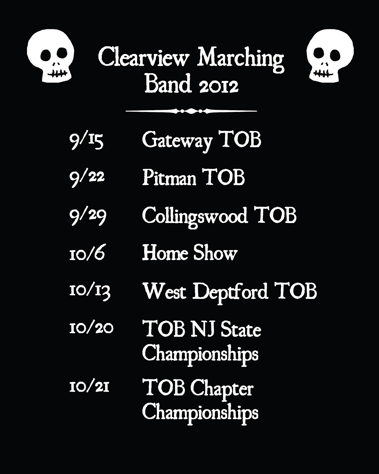
My apologies for the lack of posts. I’ve been traveling a lot in the past month and I’ve been slacking on my art stuff. Here’s something I worked on during the past week:
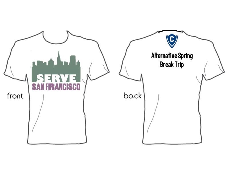
I am currently an AmeriCorps member, and I like to help my peers out when I can. When another member of my program needed help with t shirts, I volunteered my services. Her group is going on several alternative spring break trips, and they need to outfit everyone in t shirts.
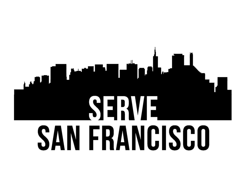
This is an idea from one of the students she works with. It was a basic design for their upcoming trip to San Francisco.
However, I wanted to try and give them something with a little more character than a city skyline. I find that it’s really hard to distinguish city skylines from each other unless there are strong visual indicators (like the Eiffel Tower in Paris), so I wanted to do something else. I drew a cable car, since I associate them with San Francisco.

Above is the basic sketch for the cable car, based on some old travel posters I found on Google.

This is was what I submitted to them for the front of the t shirt.
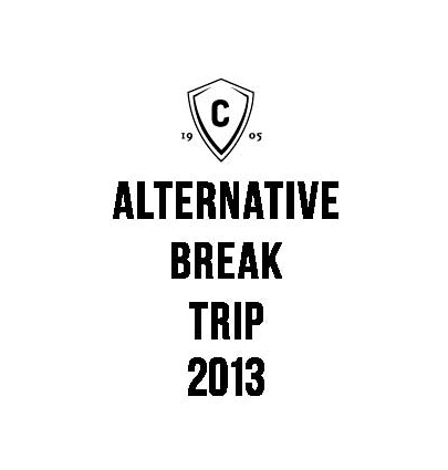
I didn’t veer very far from their original idea for the back.
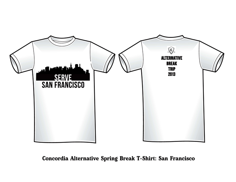
So I submitted it, and none of the alternative spring break committee members preferred my cable car design to their idea of the city skyline. So I wound up going back and creating this for them:
Below is a rough idea of what the t shirt will look like:
So there you have it. I learned not to mess with a design idea they really liked, because it cost me time and energy (especially because it was all pro-bono stuff). Meh. I still like my cable car drawing.